• We have updated our Community Code of Conduct. Please read through the new rules for the forum that are an integral part of Paradox Interactive’s User Agreement.
1. IIRC, it's hardcoded, but I think we can move enlarge it with one pixel to the left, but not right. Will check it out when home, but the question, is it worth all the work? Many counters to do for very little (1 px :rofl:) gain... Any popular support for such an fix?

2. IIRC it's hardcoded, but I will look it up when home.
1) As a matter of fact, I'd need that additional pixel to draw a better counter for the Luftwaffe. As it is now, it lacks the edges of the symbol I've drawed... I'd need to change just that one.

If it's a lot of work though, no problem: forget it!*

2) The Losses pies would be indeed a cool feature to mod but again: same as above (*) .

P.S.: did you read the PM regarding the synthetic plants icon?
 
yes sure i can sent a PM, but why for a colour thingie? iirc i never saw a skin in b&w?

I rather meant that it would be great to include skins in such an addon because adding skins it's not really the goal of the MGM mod itself but for a mod where we will add colored tech pics, world views, province pics in color etc, skins would be a good and almost neccessety. ;)
 
Perhaps we should start discussing what to do with the add-on for this mod? So all of you who like the current "style" of MGM, don't worry, the main mod will keep improving the vanilla experience within the general graphical theme of AOD, but this will be driven as a sideproject.

What I like to get done for an initial release:

1. Colored pics of the new policies. Probably the work by our great artist bestmajor after some small modifications to them.

2. Province pictures (that includes urban) in color.

3. Tech tree in colors, i.e. when you start researching and while you're researching something, that they should be a bit more in color.

4. Add some color to the diplomatic interface, i.e. the background pictures when you press "influence nation" and so on.

Any interest in this; you want to contribute, etc, just write below or PM me. Point nr 1, 2 and 4 I can probably get done tomorrow (a free day off) but nr 3 will take some time, depending how much good imagery I can get.

Until later, you can always ask/give feedback what to do next for the main MGM mod for the upcoming version 3.

Good evening folks
 
hi,

agree to all of that and doubt that getting sources for at least most of the techs should be a problem (i've finished already appr 80 of them)

but i do think we should wait a bit until a patch is released or maybe two (ie if the models or such are changed means you have to change the whole thing again which can be very time consuming)


ok basically i'll contribute which includes pics i think as i dont own photoshop and never tweaked some buttons and this stuff.

in case there are more than one contributors to one thing (eg tech pics) we should agree n certain things (eg paper clip or not, using authentic stuff only etc otherwise the end result will look messed up a lot)

bm

EDIT: what i think is more difficult is finding a picfor eg advanced heavy tank for tibet

Wise points, mr bestmajor.

Yes, standardisation is of course a must! And since the tech pics are generic, I don't think there will be any problem with finding an advanced heavy tank for tibet, because we'll just use a german... or an american. But once 1.1 is out, I'll contact you, see what you've done and what you'd like to include and I fill the gaps and we try to release is it asap once 1.1 is out? Good plan?

Interested?

Absolutley! Very nice done, mr Inner Circle! But the small union jack should be more to the right, me think, or does that corrupt when resizeing depending on what resolution you use?
 
Inspired by the early work of mr BeBro, I decided to try out a little more gradient and greyish approach to buttons etc, but with a less metallic feel than that of mr Bebro, but I don't know if I really like it... Any interest in such an improvment or is it beyond the scope of this project?

4tq1zs.png


ezjqc0.png


e5ra4x.png


34zg8sh.png
 
Inspired by the early work of mr BeBro, I decided to try out a little more gradient and greyish approach to buttons etc, but with a less metallic feel than that of mr Bebro, but I don't know if I really like it... Any interest in such an improvment or is it beyond the scope of this project?


Dunno, but it looks really nice.
 
Absolutley! Very nice done, mr Inner Circle! But the small union jack should be more to the right, me think, or does that corrupt when resizeing depending on what resolution you use?

The Union Jack has to be on this place, unless you want to see it covered by the interface when playing on lower resolutions ;)

If you´ve got any questions left, you can send me a Pm all day :)

We also have a new Skin for Germany and USSR...
 
That metallic button thing is old, it's used in many mods. But I didn't notice how well it fits into the WW2 time, I've only used it in MDS. How did you do it? I do it by taking the buttons with quick selection, make new layer and make gradient with low opacity.

E: I decided to remake the mapmode buttons with the metallic feel too. What do you guys think, is the current one better?
mapmode.jpg


I can't upload the files right now, but if you decide to use these instead, I can upload them later.
 
Last edited:
It looks good, but I think it's a little too metallic and modern for a ww2 era game. It has this very polished look while the rest of the game has more of a pastel, washed or rusty look. Know what I mean?
 
Last edited:
The Union Jack has to be on this place, unless you want to see it covered by the interface when playing on lower resolutions ;)

If you´ve got any questions left, you can send me a Pm all day :)

We also have a new Skin for Germany and USSR...

Like to see the skins for Germany and USSr, please.. Like the grand flag in the background and the sharp looking picture in the background. What could be improved is the bar to the left in the game mode, since it's to much "blank"...

That metallic button thing is old, it's used in many mods. But I didn't notice how well it fits into the WW2 time, I've only used it in MDS. How did you do it? I do it by taking the buttons with quick selection, make new layer and make gradient with low opacity.

E: I decided to remake the mapmode buttons with the metallic feel too. What do you guys think, is the current one better?
mapmode.jpg


I can't upload the files right now, but if you decide to use these instead, I can upload them later.

Yeah yours work looks good, but I've already redone them accordingly to the others but I'm unsure if I'll go for this style either way... I will try to make something better now in the afternoon.

I use hue/saturation and a gradient overlay with about 50-60% opacity and a little less filling.

It looks good, but I think it's a little too metallic and modern for a ww2 era game. It has this very polished look while the rest of the game has more of a pastel, washed or rusty look. Know what I mean?

Yeah I'm probably with you on this one, but I don't like the generic look either. So I'll have to think of something to fit that period of time... But what? Hmm...
 
Like to see the skins for Germany and USSr, please.. Like the grand flag in the background and the sharp looking picture in the background. What could be improved is the bar to the left in the game mode, since it's to much "blank"...

As you wish ;)
 
Last edited:
E: I decided to remake the mapmode buttons with the metallic feel too. What do you guys think, is the current one better?
mapmode.jpg

I can understand that Teuton might find this metallic look a little modern, but I love it. It fits perfectly with the overall look I'm trying to put together for personal use, so if it doesn't make the mod I'd really appreciate it if you would make it available to me, tuore.
 
TeutonburgerW said:
Wise points, mr bestmajor.

Yes, standardisation is of course a must! And since the tech pics are generic, I don't think there will be any problem with finding an advanced heavy tank for tibet, because we'll just use a german... or an american. But once 1.1 is out, I'll contact you, see what you've done and what you'd like to include and I fill the gaps and we try to release is it asap once 1.1 is out? Good plan?

yes i'm ok with that. its just that i dont want to change every two months the whole thing and for eg tech pics i usually search a pic of eg the new model or unit type. now if that changes the pic itself is useless. as for the tibet tank i was referring to unit pics (in case we ever reach that specific point). all in all we should team up a lot even if there are no skills except testing and maybe organising and giving feedback (but basically everything is welcome, me thinks).
as for tastes and such: IMO the best solution is to include as much as possible, no mod ever matches with every taste out there, but personally i hated to search 40 minutes for a new AA icon (as an example) so i would appreciate b/c/d options for us micromanagers.

bm
 
Yeah I'm probably with you on this one, but I don't like the generic look either. So I'll have to think of something to fit that period of time... But what? Hmm...

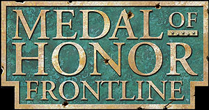
If u can do somehing like the background of the text here I think it will look awesome :D. It may be a bit difficult from what I know. Inspiration at leat...

You know, rusty and worn

mohaa3vw.png


Here is a green one too

logo.jpg
 
Last edited:
I personally like the metallic look, makes everything look much smoother and cleaner.
 
If u can do somehing like the background of the text here I think it will look awesome :D. It may be a bit difficult from what I know. Inspiration at leat...

You know, rusty and worn

mohaa3vw.png


Here is a green one too

logo.jpg

Yeah, they look good but they have the "freedom" to use on a rather large logo. making such work looks good in 40 x 40 pixels is a completly different business. :(

I've tried the rusty and the wooden look by now, but ain't really satisfied. I think the best option to do, is to use a gradient map and some other color than black&white for it to not look so metallic/modern, but I've yet to figure out a good cooler that looks good anf feels WW2ish.......