
Stellaris Development Diary June 27th - New Skyboxes
- Thread starter Aerie
- Start date

-
We have updated our Community Code of Conduct. Please read through the new rules for the forum that are an integral part of Paradox Interactive’s User Agreement.
You are using an out of date browser. It may not display this or other websites correctly.
You should upgrade or use an alternative browser.
You should upgrade or use an alternative browser.
Cheers for the DD Aerie  . Love the detail you've gone into there, and even more the attention to detail in getting the star systems looking schmexier . Stellaris has got a great atmosphere, and it's work like this that produces it .
Oh, and pun of the week.
. Love the detail you've gone into there, and even more the attention to detail in getting the star systems looking schmexier . Stellaris has got a great atmosphere, and it's work like this that produces it .Oh, and pun of the week
.We had only limited previous experience with fluid dynamics, but it's always good to try new solutions.
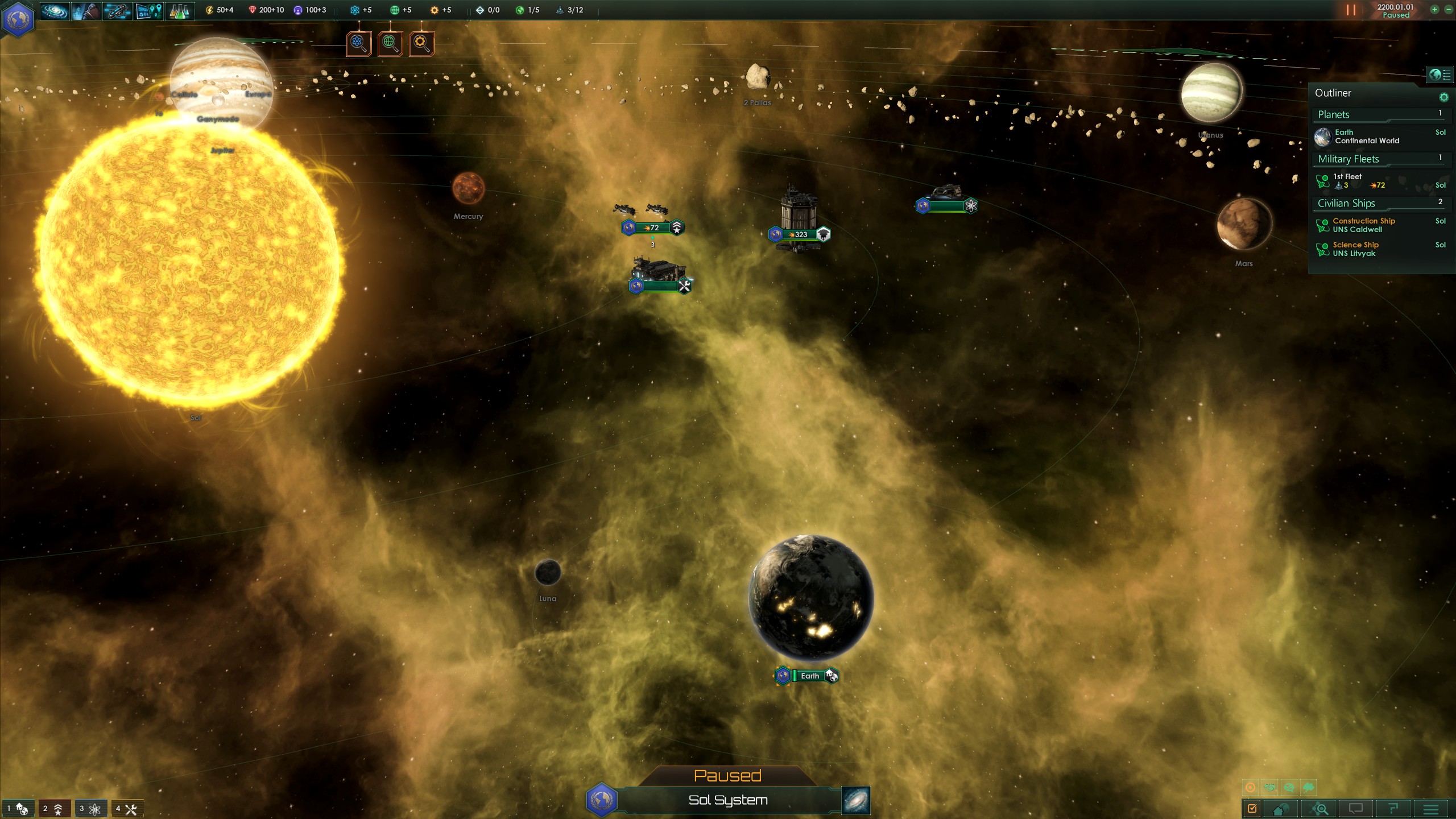
It looks nice, but isn't the lighting a little intense? Look at this screenshot of the Sol system. Every object is bathed in so much yellow that they become varying shades of yellow, green, and brown.
- 10
- 1
Fascinating. And the end result is worth it. These new skyboxes look fantastic!
- 2
- 1
Ehehehe, you should ask CCP, how they did it with the stars in EVE Online, you can see the stars of neighbouring systems brighter then the normal background stars.
Indeed, eve skyboxes are gorgeous.
Nice work. Sci-fi actual space games tend to have indeed boring skyboxes. The issue is also that real space is pretty dark, and that NASA space pics are amplified or fake colored, so everyone expects unrealistic fantasy art. I find the 1.2 sky, though, too sharp, as if ... it would need to be more milky and smooth? Not sure.
Any chance to get access to the shader files? If it is just shader coding, of course. I'm not that bad at these things...
- Here's rather a star dust implementation: https://www.shadertoy.com/view/Mll3zj
- This is also some nice particle work: https://www.shadertoy.com/view/MdKXzc
- Also a rather soft space screen: https://forum.unity3d.com/attachments/spaceskybox01-png.84913/
- This nebula generator is also interesting:
Here are some composition ideas
- The background, not the planet or the front assets: https://images3.alphacoders.com/127/127957.jpg
I would also parallax move the background a bit with the mouse cursor, in order to show a tiny bit of depth. In general, I would go straight 3D and play with different levels
I think that the space background should be always more artsy than technical or realistic. Because space itself is dull, empty, and boring. And in games like Stellaris, I still have constantly to look at that background. It is also interesting how Master of Orion (not that I'm playing anything else than Stellaris, of course!) solves this topic. Interesting issue though. Look forward to more.
And thanks to everyone, for your feedback. Would love to spend more time on this, and perhaps do somthing like procedural sky boxes.
The shader files are there for you to edit. sky.shader
- 3
How many minerals do I have to throw at my screen before we can get individual, wallpaper-sized versions of those screenshots?
Seconded. Or 7thed based on the "Agree" votes on the post when I clicked it.
And hey, I got to the DD only a few hours after it went up, and all I had to do was stay up until 3:00 A.M.
Wow. Now that I'm seeing them in-game they do make a big difference. This adds a lot of character to the system screens.
And BTW, how do you get the cat-people avatar? My Feline race needs me to represent!
And BTW, how do you get the cat-people avatar? My Feline race needs me to represent!
@Aerie Would you be willing to release some additional infos for us modders?
For example how is the Skybox's cube map wrapped?
In a quick test it looked like its 'Front:Back:Top:Bottom:Left:Right' from left to right in the file.
Is that correct?
Is it the same case for the filtered
How does the environment_map interact with the galaxy_background? Do they just get blended into each other?
It seems like 'world tag identifier' determines which background would be used, what happens when there are more than one star in a system? Will only the first one count?
Thanks a lot!
Last edited:
Sorry to say, I don't like these sky boxes.
My opinions on space being black and not bright yellow, and why nebulae can go and fuck themselves are well documented. But this goes beyond realism or aesthetic concerns - the colours are so intense it actually makes the import things in the system (i.e the planets and the ships) stand out less.
Case in point is the screenshot Kerschey posted. It looks like the sky is full of scrambled eggs. Like, woaaah, sister, back off on them nebula.
My feedback, for what it's worth, would be to tone down the both the colours and the intensity of the clouds. I understand that not everyone shares my preference that space should be depicted as a pitch-black abyss of unfathomable darkness, so you should probably still keep them in the skyboxes - but those nebulae are just way over the top.
The exception would for systems that are actually in nebula on the galactic map. You can go crazy with those ones. At the moment, there's no visual distinction between systems that are in normal space and those that are inside nebula, they both have the same incredibly intense coloured clouds completely dominating the skyboxes. Which is a bit odd.
Last edited:
- 5
- 2
- 1
Or at least just give us the choice of returning to the old one.
I don't like the new skybox and the praise around here seems a little surprising, or maybe the dissenters just aren't being vocal.
Basically it just doesn't seem natural and the colors are just too bright and throwing too much of one color all at once. The previous skybox was fine really.
I don't like the new skybox and the praise around here seems a little surprising, or maybe the dissenters just aren't being vocal.
Basically it just doesn't seem natural and the colors are just too bright and throwing too much of one color all at once. The previous skybox was fine really.
- 2
@Aerie Would you be willing to release some additional infos for us modders?
For example how is the Skybox's cube map wrapped?
In a quick test it looked like its 'Front:Back:Top:Bottom:Left:Right' from left to right in the file.
Is that correct?
Is it the same case for the filtered
How does the environment_map interact with the galaxy_background? Do they just get blended into each other?
It seems like 'world tag identifier' determines which background would be used, what happens when there are more than one star in a system? Will only the first one count?
Thanks a lot!
The environment map is use for the reflections on the ship.
We use Nvidia's .dds plugin, it saves the cubemap like the image at the top.

- 5
@Aerie
Ah, didnt think if it being for the entities, i was cracking my brain on figuring out how a environment map could work on a skybox XD
Thanks a lot!
Ah, didnt think if it being for the entities, i was cracking my brain on figuring out how a environment map could work on a skybox XD
Thanks a lot!
CCP has a major advantage on doing this with their Skybox.Ehehehe, you should ask CCP, how they did it with the stars in EVE Online, you can see the stars of neighbouring systems brighter then the normal background stars.
They have a static map. Oh, sure they have a lot of objects they have to simulate. But their location is fixed compared to each other. They can far more easily do it. The game need only know where it is in relation to other features. So those nebula, it can use the 3D that it has to tell itself that based on it's angle, this is what it looks like. Same with the other stars. Which pretty much don't move from your position.
So it is much less work to design it to do it by relative position. But Stellaris is generating a map. You have to make the map first. Than the game must then determine what each star's relative position to each other is. Then it must model what each in-system map is getting for a skybox.
And unlike CCP, this must be done by your computer. CCP has servers that handle the hard work of determining where things are in position to each other. It is divided up into chucks of system, yes. But they still have servers to communicate this. Your computer is only using the data given to it to make the skybox. It is not handling the work of letting you know where everything is. Now, this is not to say that Paradox can't do the coding needed to achieve this on the average computer.
But here is the thing: It takes time. At least, it will if you don't want to screw up. The Asimov skyboxes are static 3D images. They are simpler. They can be done much quicker.
I see this being something they do later, at the very least after Heinlein is done. They probably prefer finding the big issues and fixing those before making the sky candy even prettier and generating it based of nearby things. This sort of thing will take time to do.
Not however right now. It is probably something they have in their "want to do" list, but they don't because they don't have the time for it.
Especially since manpower is split between EU4, HOI4, Stellaris, and the projects we don't see from our customer perspective.
- 2
- 2
Hi @Aerie thanks for your hard work on Stellaris and the recent Azimov patch. I'd like to offer some constructive criticism on the new skyboxes if you're open to reading it. Hopefully you'll take it as encouragement to keep working at improving them in future updates.
While I think the new skyboxes have a much higher image quality I'm afraid I can't say they are an improvement aesthetically. For me this really came down to only two points, which I think make a huge difference to the visuals. I'm just going to compare the skybox in the Sol system before and after Azimov.


Cloud density
While the three new skyboxes have varying amounts of 'cloud' in them, all of the cloud is quite dense and thick. The original skybox had much less dense clouds of this dust but the overall coverage was higher while the falloff was much, much softer. Looking at the two in comparison you can see straight away that the cloud edges are far more distinct in the new skyboxes, and that the density was overall higher. The problem is that this just leads to it looking like a "spray-paint" style effect, as if someone sprayed some beautiful graffiti on this inside of a black sphere.
Looking at purely the value information (with no distracting colours) we can see that the new skybox looks way too dense and it makes the system view much less readable because of it. It's much harder to pick out interesting visual details like the asteroid belt and tiny planets when the skybox is so overpowering and visually busy. Would you try tweaking the simulation settings in Maya to greatly reduce the density and increase the falloff of the particle clouds? Maybe adding multiple concentric layers of simulations with lower density would give a better sense of depth to the skyboxes and avoid the current problem of looking like thick streaks of cloud.


Colour tints
Altering the hue and tint of the skyboxes is a great idea to add further variation without needing to author more textures. But as it is currently done, aesthetically I don't think that having the skybox match the star colour worked very well. It just results in a single colour palette being used across so much more of the screen, this is especially problematic when the colouring is so strong against the starscape as it makes the actual objects in the system harder to distinguish visually.
The original skybox worked best against yellow and oranges stars, because it provided a complimentary contrast to them and allowed the objects in the system to pop against the background. Would you please tone down the strength of the colour correction and work on tuning the hue values used to create a more complimentary and subtle background?
I've done a touched up version of the last image in the Dev Diary to illustrate what I mean by more complimentary skybox colours. The 3D objects in the system still get lit by the colour of the star so will stand out better rather than being lost against the skybox.

I really hope you'll take another look at the skyboxes for Heinlein, because with the new method of creating them and the colour tinting I think you're onto a great idea and it's so close to creating great results.
While I think the new skyboxes have a much higher image quality I'm afraid I can't say they are an improvement aesthetically. For me this really came down to only two points, which I think make a huge difference to the visuals. I'm just going to compare the skybox in the Sol system before and after Azimov.
Cloud density
While the three new skyboxes have varying amounts of 'cloud' in them, all of the cloud is quite dense and thick. The original skybox had much less dense clouds of this dust but the overall coverage was higher while the falloff was much, much softer. Looking at the two in comparison you can see straight away that the cloud edges are far more distinct in the new skyboxes, and that the density was overall higher. The problem is that this just leads to it looking like a "spray-paint" style effect, as if someone sprayed some beautiful graffiti on this inside of a black sphere.
Looking at purely the value information (with no distracting colours) we can see that the new skybox looks way too dense and it makes the system view much less readable because of it. It's much harder to pick out interesting visual details like the asteroid belt and tiny planets when the skybox is so overpowering and visually busy. Would you try tweaking the simulation settings in Maya to greatly reduce the density and increase the falloff of the particle clouds? Maybe adding multiple concentric layers of simulations with lower density would give a better sense of depth to the skyboxes and avoid the current problem of looking like thick streaks of cloud.
Colour tints
Altering the hue and tint of the skyboxes is a great idea to add further variation without needing to author more textures. But as it is currently done, aesthetically I don't think that having the skybox match the star colour worked very well. It just results in a single colour palette being used across so much more of the screen, this is especially problematic when the colouring is so strong against the starscape as it makes the actual objects in the system harder to distinguish visually.
The original skybox worked best against yellow and oranges stars, because it provided a complimentary contrast to them and allowed the objects in the system to pop against the background. Would you please tone down the strength of the colour correction and work on tuning the hue values used to create a more complimentary and subtle background?
I've done a touched up version of the last image in the Dev Diary to illustrate what I mean by more complimentary skybox colours. The 3D objects in the system still get lit by the colour of the star so will stand out better rather than being lost against the skybox.
I really hope you'll take another look at the skyboxes for Heinlein, because with the new method of creating them and the colour tinting I think you're onto a great idea and it's so close to creating great results.
- 4
- 4
Shores of Hazeron also does this which makes traveling between systems at light or FTL speed a lot of fun.Ehehehe, you should ask CCP, how they did it with the stars in EVE Online, you can see the stars of neighbouring systems brighter then the normal background stars.
See: http://hazeron.com/wiki/index.php/File:DeadheadTravel.png
Not sure it would make a lot of difference in Stellaris though, since the galaxy is kinda flat and we are mostly only looking down.