

I know this first subject will be contentious, but I'm just throwing it out there for discussion.
I know those of us who are fans of Eugen games don't need it and that most would probably prefer not to have it etc, but please have consideration of what is best for making the game successful. I think Steel Division 2 can be a far more successful game without changing the gameplay, but by just changing the visual information fed to the player.
Most people who play in a Wargame beta or release, or on Steel Division's Beta and release month, clearly have difficulty with understanding WTF is going on. I know it's fun frustrating these players for those first few weeks before they leave and never come back. Consider a game with a larger population, better reviews, more recommendations, more future content etc by making it easier to pick up and play and understand. This is a way of making the game more accessible without dumbing it down.
Fog of War and Displayed Line of Fire on Unit Selection:
- Display Line of Fire on selected units (Similar to R.U.S.E). Effectively on Unit Selection something like the Display Line of Sight control displayed centred on the unit.
- Introduce Fog of War.
(Instead of Fog Of War there instead could be Line of Sight displayed on Units, such as like Recon in R.U.S.E, but I think better to just have Fog Of War.)
Of course a big part of introducing something like Fog Of War is how Optics interacts with Stealth. This would likely be done by having 3 or 4 Levels of Fog Of War and having just 3 or 4 levels of Stealth on units:
For example where units cast Optics that can see any enemy units Fog Of War is removed.
Where units cast Good Optics there would be a Light Fog of War that you can see any Low Stealth Units within.
Where the units of you and your allies cast a Medium Optics there is a medium Fog Of War which is a darker and denser fog that within you can see any enemy units of Medium Stealth etc.
If people have visual information of where they can and can't see enemy units, if when people select a unit they can see where that unit can fire, then it will make the game far more easy for new players to pickup and play and and settle into the game understanding what they are doing with units and the consequences of where they are positioning units.
I know that will have been a contentious issue, but I think my other main concern will be far more agreeable...
Unit Icons upgrade:
The other big weakness in SD1, and Wargame, is just how aesthetically unappealing and unengaging the Unit Icons are.
In SD1 the Dog Tag-like big silver Unit Icons look so cluttered and clunky and give no information.
I think I'd experiment with changing them to two potential styles:
1. 3D models - a sort of Huge Unit Scaling but a Blue/Green/Red model (for Yours/Allies/Enemies units). Though I think this could be far better than Unit Icons in SD1, ultimately this could look quite cluttered, ugly, and blobby and I prefer 2.:
2. 2D Unit Icons, like the current SD1 Unit Icons, but without the background - just the silhouette of an Infantry man or a tank. Also make it all sexy and fluorescent Blue/Green/Red in a sort of electronic visual and make it animated:
When infantry squad is moving have the 2D silhouette of a man animated as running.
When Infantry squad are in combat have the 2D man animated as shooting.
When Pinned-Down animated as laying down with arms over head.
When in building animated as crouching next to a window or whatever and when in combat animated as shooting from the window, or just as usual but a Roof symbol above.
Similarly with tanks and vehicles when they are moving animate the 2D icon of it with the tracks rolling and dirt coming up, could do different animations for Fast Move and Hunt etc, and when in combat animated as shooting from the window, or just as usual but a Roof symbol above.
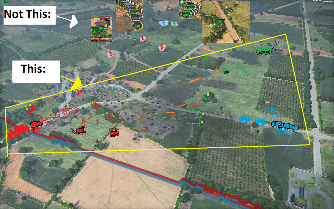
I have zero artistic skill on MS Paint but just to roughly show what I'm talking about incase I have not articulated it very well:
(This is supposed to be representation of how 2D Unit Icons could be - Not 3D):
What comes to mind when I think of the aesthetic of these Unit Icons is sort of similar to walk signs:
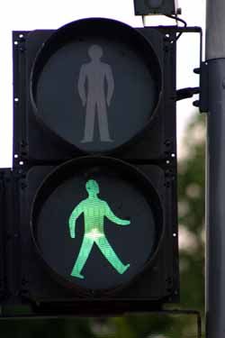
But slimmer, more detailed, more militaristic etc. Just that sort of fluorescent electronic aesthetic, maybe slight black outlines etc.
Basically take 2D Unit Icons as they are. Remove the Silver backdrop and make the silhouette more glowy, electronic. Make them animated to give visual information what is going on and bring battlefield alive.
As there is no background so selecting a thin silhouette of a man/vehicle could be difficult, that could be balanced by the icon having a transparent selection area around it, maybe also visually a thin box or 4 unconnected thin lines around the silhouette showing select area.
Also with these 2D icons could experiment with changing which direction they face to roughly reflect which direction the unit is travelling/facing/firing.
I think Fog Of War and displaying Line of Fire on Unit Selection will make game far more accessible, popular and sucessful without dumbing down the game.
I know this one is a contentious issue and I'm just bringing it up for discussion as it is a major discussion that since the release of Wargame European Escalation I've never seen it ever questioned or any discussion concerning it.
I think that with such improved animated Unit Icons without background the battlefield is less cluttered as backgrounds aren't blocking terrain around unit, the icons aren't blocking other units they are next to and overlapping, they give more information at a glance etc and overall the game will look better and make the battlefield more alive and engaging.
I know those of us who are fans of Eugen games don't need it and that most would probably prefer not to have it etc, but please have consideration of what is best for making the game successful. I think Steel Division 2 can be a far more successful game without changing the gameplay, but by just changing the visual information fed to the player.
Most people who play in a Wargame beta or release, or on Steel Division's Beta and release month, clearly have difficulty with understanding WTF is going on. I know it's fun frustrating these players for those first few weeks before they leave and never come back. Consider a game with a larger population, better reviews, more recommendations, more future content etc by making it easier to pick up and play and understand. This is a way of making the game more accessible without dumbing it down.
Fog of War and Displayed Line of Fire on Unit Selection:
- Display Line of Fire on selected units (Similar to R.U.S.E). Effectively on Unit Selection something like the Display Line of Sight control displayed centred on the unit.
- Introduce Fog of War.
(Instead of Fog Of War there instead could be Line of Sight displayed on Units, such as like Recon in R.U.S.E, but I think better to just have Fog Of War.)
Of course a big part of introducing something like Fog Of War is how Optics interacts with Stealth. This would likely be done by having 3 or 4 Levels of Fog Of War and having just 3 or 4 levels of Stealth on units:
For example where units cast Optics that can see any enemy units Fog Of War is removed.
Where units cast Good Optics there would be a Light Fog of War that you can see any Low Stealth Units within.
Where the units of you and your allies cast a Medium Optics there is a medium Fog Of War which is a darker and denser fog that within you can see any enemy units of Medium Stealth etc.
If people have visual information of where they can and can't see enemy units, if when people select a unit they can see where that unit can fire, then it will make the game far more easy for new players to pickup and play and and settle into the game understanding what they are doing with units and the consequences of where they are positioning units.
I know that will have been a contentious issue, but I think my other main concern will be far more agreeable...
Unit Icons upgrade:
The other big weakness in SD1, and Wargame, is just how aesthetically unappealing and unengaging the Unit Icons are.
In SD1 the Dog Tag-like big silver Unit Icons look so cluttered and clunky and give no information.
I think I'd experiment with changing them to two potential styles:
1. 3D models - a sort of Huge Unit Scaling but a Blue/Green/Red model (for Yours/Allies/Enemies units). Though I think this could be far better than Unit Icons in SD1, ultimately this could look quite cluttered, ugly, and blobby and I prefer 2.:
2. 2D Unit Icons, like the current SD1 Unit Icons, but without the background - just the silhouette of an Infantry man or a tank. Also make it all sexy and fluorescent Blue/Green/Red in a sort of electronic visual and make it animated:
When infantry squad is moving have the 2D silhouette of a man animated as running.
When Infantry squad are in combat have the 2D man animated as shooting.
When Pinned-Down animated as laying down with arms over head.
When in building animated as crouching next to a window or whatever and when in combat animated as shooting from the window, or just as usual but a Roof symbol above.
Similarly with tanks and vehicles when they are moving animate the 2D icon of it with the tracks rolling and dirt coming up, could do different animations for Fast Move and Hunt etc, and when in combat animated as shooting from the window, or just as usual but a Roof symbol above.
I have zero artistic skill on MS Paint but just to roughly show what I'm talking about incase I have not articulated it very well:
(This is supposed to be representation of how 2D Unit Icons could be - Not 3D):
What comes to mind when I think of the aesthetic of these Unit Icons is sort of similar to walk signs:
But slimmer, more detailed, more militaristic etc. Just that sort of fluorescent electronic aesthetic, maybe slight black outlines etc.
Basically take 2D Unit Icons as they are. Remove the Silver backdrop and make the silhouette more glowy, electronic. Make them animated to give visual information what is going on and bring battlefield alive.
As there is no background so selecting a thin silhouette of a man/vehicle could be difficult, that could be balanced by the icon having a transparent selection area around it, maybe also visually a thin box or 4 unconnected thin lines around the silhouette showing select area.
Also with these 2D icons could experiment with changing which direction they face to roughly reflect which direction the unit is travelling/facing/firing.
I think Fog Of War and displaying Line of Fire on Unit Selection will make game far more accessible, popular and sucessful without dumbing down the game.
I know this one is a contentious issue and I'm just bringing it up for discussion as it is a major discussion that since the release of Wargame European Escalation I've never seen it ever questioned or any discussion concerning it.
I think that with such improved animated Unit Icons without background the battlefield is less cluttered as backgrounds aren't blocking terrain around unit, the icons aren't blocking other units they are next to and overlapping, they give more information at a glance etc and overall the game will look better and make the battlefield more alive and engaging.