Europa Universalis IV: DLC Render Pictures Archive

  • We have updated our Community Code of Conduct. Please read through the new rules for the forum that are an integral part of Paradox Interactive’s User Agreement.
Trade Nations Unit Pack
Unique trade nation unit models for Hansa, Novgorod, Aragorn and Genoa
I can't quite believe that you misspelled Aragon.
Aragorn is the guy from Lord of the Rings - Aragon is an Iberian Kingdom.
 
I highly doubt that.

I thought the joke was to put Aragon and Genoa, bitter enemies, in the same pack.

I like the new Trade Nations sprites, I only wish they paid more attention in making Aragon. Their sprites for first and second tiers are completely fantasious, or at the very best, not at all representative of Aragonese military style.
 
Merely expressing my appreciation of the stunning ship models, western, muslim and indian alike. Looking forward to seeing them all here in this thread close to one another for comparison. : )
 
Could you guys also upload the renders for the Indian Subcontinent Unit Pack and the Indian Ships? Would be really peachy of you.
 
Near a month... No rander for those two?
 
Near a month... No rander for those two?
Not sure if you noticed but the OP hasn't replied to this thread ever since I pointed out that the Kingdom in Iberia is called Aragon and not Aragorn.
 
Why are the shoulders of all those models so excessively broad (most historical styles emphasized rather slender shoulders)? And why are the necks so long? And the upper body is also too long. These models look strange, I'm sorry. And the clothes look put on, without any regard of the cuts and the fitting and materials of the historical models. In most cases, the waistline sits by far too low. I don't know if all this is due to technical limitations (the animation/bones of the models), fear of offending modern aesthetical codes of coolness ("Ahrg, the hip of this model stands out! How uncool and feminine!?") or the nescience of the artists. Unfortunately the result looks like mediocre tin soldiers. :( There is no way you can capture the elegance of the epoques with these crude/disproportionate base models.

I wished these were 2d, then one could mod them easily - the same goes for the map. There is NO reason at all why these things are in 3d. If anything 3d (and the animations) make the map look more crowded and confusing, and I'm not even talking about the ugly, chaotic borders of the political unities. I'm sure that a 2D map would have looked much better and immersive (other games' maps certainly do!). In fact I would get rid of all 3D until it manages to look at least as good as 2d.
 
Last edited:
Why are the shoulders of all those models so excessively broad (most historical styles emphasized rather slender shoulders)? And why are the necks so long? And the upper body is also too long. These models look strange, I'm sorry. And the clothes look put on, without any regard of the cuts and the fitting and materials of the historical models. In most cases, the waistline sits by far too low. I don't know if all this is due to technical limitations (the animation/bones of the models), fear of offending modern aesthetical codes of coolness ("Ahrg, the hip of this model stands out! How uncool and feminine!?") or the nescience of the artists. Unfortunately the result looks like mediocre tin soldiers. :( There is no way you can capture the elegance of the epoques with these crude/disproportionate base models.

I wished these were 2d, then one could mod them easily - the same goes for the map. There is NO reason at all why these things are in 3d. If anything 3d (and the animations) make the map look more crowded and confusing, and I'm not even talking about the ugly, chaotic borders of the political unities. I'm sure that a 2D map would have looked much better and immersive (other games' maps certainly do!). In fact I would get rid of all 3D until it manages to look at least as good as 2d.

Let's play spot the grognard :p

I think you've missed the boat by quite a fair margin for complaining about 3D, considering it's been a staple of Paradox games since the launch of EUIII. 2D games can certainly be beautiful, but I for one love the beautiful 3d maps in EUIV and CK2. My only complaint is the over-emphasized elevations in the vanilla map making the political map mode look too bumpy, but there are literally dozens of map modes that fix this easily.

Also, there is a very good reason Paradox uses 3d. It sells. Grand strategy games are niche enough without being stuck a decade and half behind everyone else. If Paradox had stuck solely to 2d, they'd be as obscure as AGEOD who, while making great games, are virtually unknown outside of a community of a few hundred diehard fans. And I can't even begin to imagine how you can call the EUIV and CK2 maps 'cluttered,' especially considering the various colourful doodads are only visible in the geographic map-mode and are fairly low-key.

I also think calling models 'terrible' is pushing it a fair deal. Sure, the models are nothing special up-close in comparison to say, the Witcher 3, but EUIV is a strategy game played from a bird's eye view and so some leeway has to be given. If you want to play a game for stunning graphics, I don't believe a grand strategy game is going to fit the bill. They aren't called spreadsheet simulators for nothing, and EUIV is the least spreadsheety of all!

As for proportions, remember that these are essentially tabletop miniatures translated into 3d models, and by necessity details have to be cut or simplified in order to achieve a better aesthetic in context. Even then, whatever travesty of proportions you claim to see is so miniscule that I can barely notice it even on the zoomed-in promotional shots, let alone in-game.
 
Sure, it's my personal opinion. I just think that the 3d map (which looks good if zoomed out) is less immersive than a good 2d map could be. I'd also say that it looks kind of rough/blurry/not sharp or crisp enough (in regards to the portrayal of geographic-strategical features) and "childish" to me (can't really express why; probably also colour-related). For a historical setting, a real "map" rather than a modern satellite view would be more appropriate. Moreover, I just don't see why the map is actually 3D. I mean you can't rotate it and elevations play no role whatsoever. So what is the advantage of 3D, other than the fact that zooming out changes the angle a bit? Well the maps are not neccessarily cluttered. It's more that they're very chaotic. I figured out that this impression might be less related to 3D but rather to the fact that the provinces names are written everywhere in different sizes and angles. It looks ugly. And once they're 10 armies moving around over these province-names, things look cluttered. Indeed AGEOD games offer some of the best and most beautiful maps I've seen so far, not only fulfilling their role for the game, but also being very beautifull and appropriate for the games' epoque. I don't think that these games are not popular because of 2D, rather because of their complexity, because they require a lot of thinking (in relation to actual clicking) and lack what players consider "action".

As for the models: I'm sorry, but for me it's so damn obvious that the proportions of these models are just wrong. You can't tell me that these models look proportionate to you. The argument that these models are never to be seen as close up in the game as in these render-pictures is valid though. But I think this will change in AoW (see the respective screenshots).

Comparison
image-2.jpg

Link to fullsize: http://www.histogames.com/images/news/mai2014/043/image-2.jpg
eu4-france.jpg


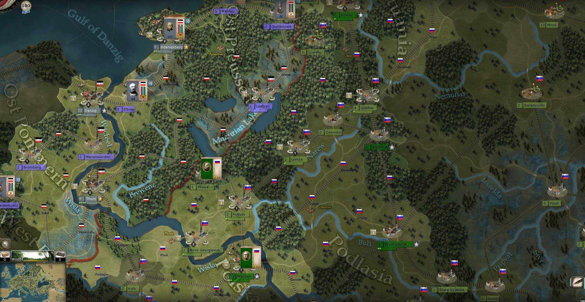
Sure, you could say that EU is primarily played in the political map filter (which looks dull!). But comparing the topographical filter shows a lot of differences. Indeed here the AGEOD map looks more crowded, which is related to the fact that the game needs to give you more information via the map. In fact it looks rather uncrowded if you keep in mind how much information is given. In EU, information that noone really needs takes up quite a bit of space (those huge province names). AGEODs map is elegantly reduced to the stuff you actually need to know (also in terms of immersion - river names should be more important than province names imho) and the terrain features in general are much more crisp than the dispersed bumps that are meant to represent trees on EUs map. EUs map with those little individual trees and individual soldiers gives me the impression as if Europe was the size of a Warcraft III map. I can't really tell what it is. It just looks as if the brush that was used to "paint" EUs map was too big/not detailed enough. Also in other respects EUs map could take an example. If regions or political unitities were actually highlighted a bit on a mouse-over, there would be no need for those thick and ugly borders on the map which look as if someone had placed measuring tapes all over the place. It looks so .... unsophisticated and I think the reason why is related to 3D. Sure, the EU map is not as detailed/zoomed-in since EU covers the whole world, but that is different story. Even at this level of detail it could be better.

Funny enough, in one of AGEODs games there was an option to replace the 2d counters for armies with 3d models. As far as I can tell, nobody ever used this option (there might have been countless reasons why).
 
Last edited: