Elements of bad user experience from the previous UI are still present in the new one... Some of the new changes are actually a downgrade.

  • We have updated our Community Code of Conduct. Please read through the new rules for the forum that are an integral part of Paradox Interactive’s User Agreement.
View attachment 682210

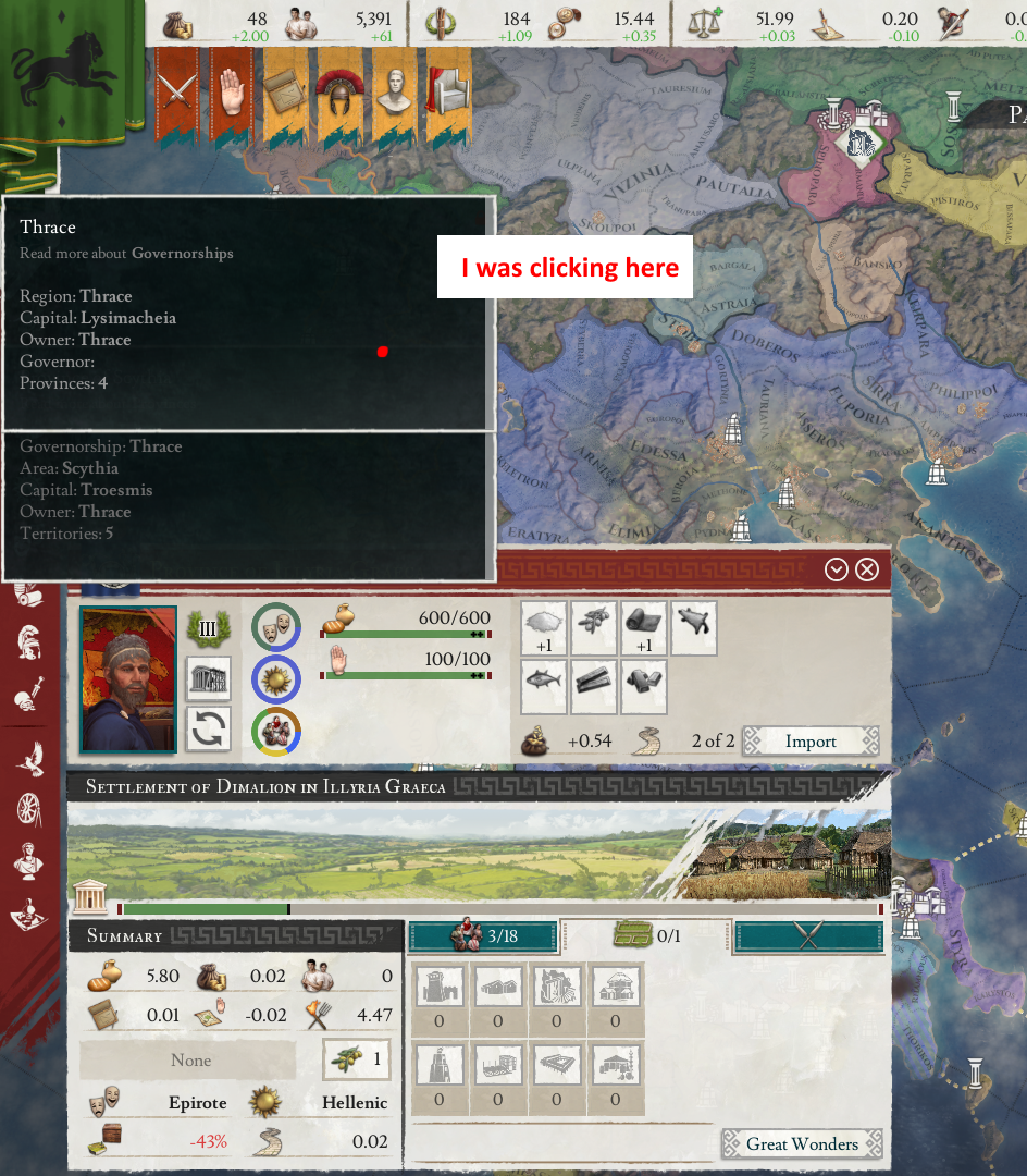
I bet everyone has tried to click a province flag, only to have the click be mis-registered as a click on the province banner. (causing the Governor/demographics/trade details banner to be displayed instead)


THIS one is driving me nuts right now!!!

Please fix that one Paradox, should be a quick easy fix, make the clickable area bigger! :)
 
  • 6Like
Reactions:
I can't see the frame of my observed area on the map. I think it should be black.

1.jpg
 
  • 13Like
  • 7
  • 1
Reactions:
I really enjoy most of the changes in 2.0 but I gotta admit that Imperator suffers severely from information overload. My eyes literally hurt when I opened the trade window, but that might have something to do with the crazy brightness. That being said, I'm not really sure what they could do to change this, because I:R has a lot of information to track.
 
  • 1Like
Reactions:
What almost drove me mad yesterday evening was that distracting loading bar on every single tooltip. It's impossible to ignore (almost white on black) while completely unnessecary (i got it like the third time that it takes about 2 sec to pin it). If you really want the player to see if a tooltip is pinned, just add a small icon at the top right corner or smth. But please, for the love of the entire Pantheon, get rid of this monstrosity.
 
  • 4
  • 1Like
Reactions:
I really enjoy most of the changes in 2.0 but I gotta admit that Imperator suffers severely from information overload. My eyes literally hurt when I opened the trade window, but that might have something to do with the crazy brightness. That being said, I'm not really sure what they could do to change this, because I:R has a lot of information to track.
That's an issue with the overarching game design. Why this game isn't character oriented like Crusader Kings in an era where major events are driven by individual actors is hard to understand.

The game wants the player to manage an entire realm while removing any and all delegation of duties (you cannot assign governors to rule in your stead, etc. because you play as the "state" and are therefore expected to micromanage every aspect of your nation).

This game should have gone even deeper than Crusader Kings in regards to roleplaying as a single character. Orienting gameplay to such a degree would allow for more interesting storytelling. As it stands, with the current way IE is set up the game rewards minmaxing bonuses and pressing meaningless buttons than actual interesting gameplay.
 
Last edited:
  • 15
  • 7
Reactions:
What almost drove me mad yesterday evening was that distracting loading bar on every single tooltip. It's impossible to ignore (almost white on black) while completely unnessecary (i got it like the third time that it takes about 2 sec to pin it). If you really want the player to see if a tooltip is pinned, just add a small icon at the top right corner or smth. But please, for the love of the entire Pantheon, get rid of this monstrosity.
Yes, the new tooltips are extremely intrusive. They imported that "feature" from CK3 wholesale even though it requires tweaking at the minimum. As for your problem, you can change that in the settings menu so that it only "pins" a tooltip when you press the middle mouse button or not at all.
 
  • 5
Reactions:
What almost drove me mad yesterday evening was that distracting loading bar on every single tooltip. It's impossible to ignore (almost white on black) while completely unnessecary (i got it like the third time that it takes about 2 sec to pin it). If you really want the player to see if a tooltip is pinned, just add a small icon at the top right corner or smth. But please, for the love of the entire Pantheon, get rid of this monstrosity.
Try Settings->Game-Tooltip Mode as something else, like Mouse Tendency.
 
  • 6
Reactions:
-This toolping is confusing, where does the 77 disloyal powerbase come from? There is only one disloyal character with 42.60 powerbase, why are they showing me every great family?? where does the other 33.40 disloyal powerbase come from?
power.PNG


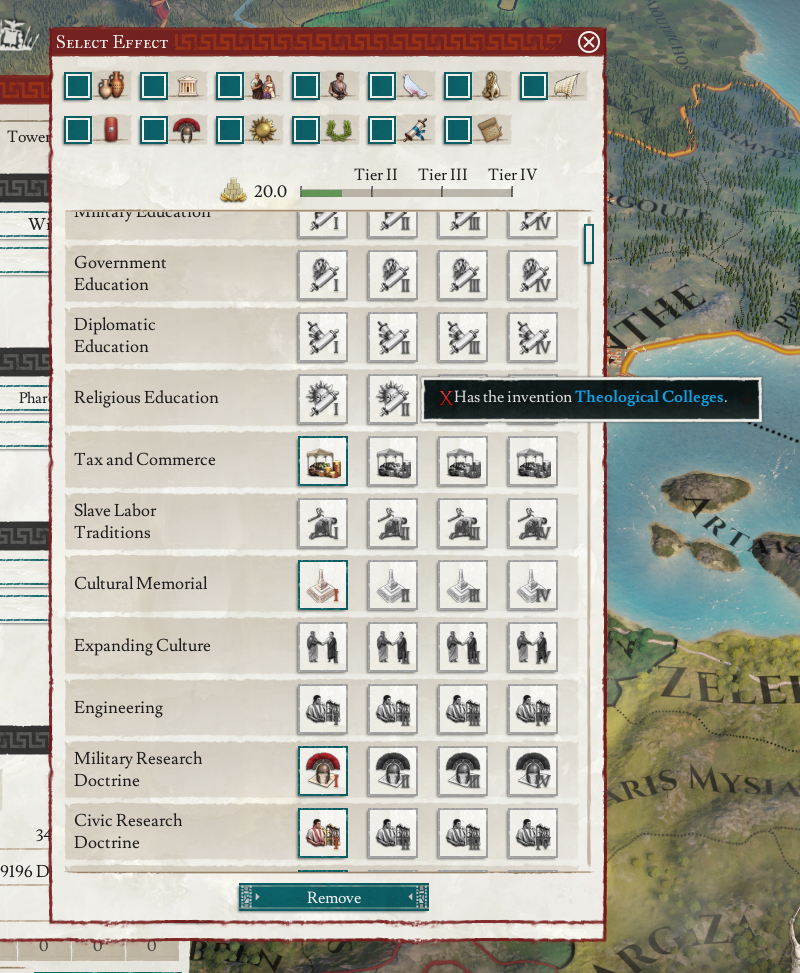
-You can't see the bonus of a wonder effect you haven't unlocked
wonder.png


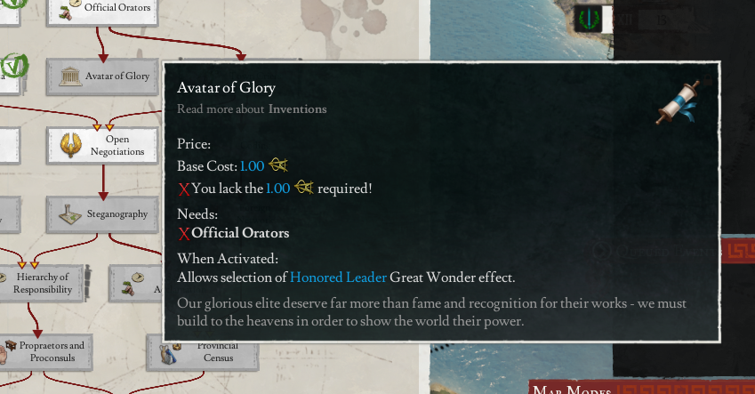
-And you can't even see it in the invention tooltip! And that "Honored Leader" blue name? Useless! You can't hover it for more information!
wonder2.png


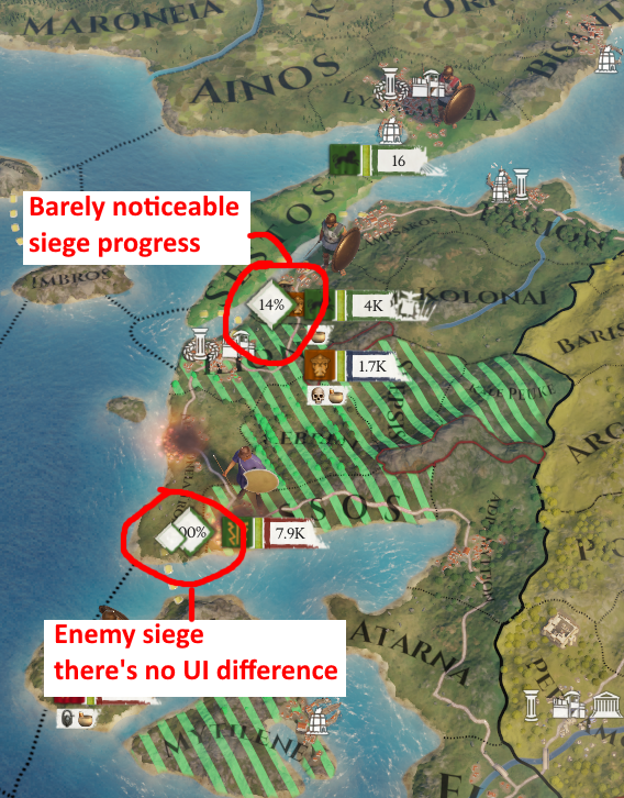
-Also let's talk about the siege icon, I like it, but please it should be easier to see! It's almost the same color of the terrain, could the borders of the icon at least be more defined?
siege.png


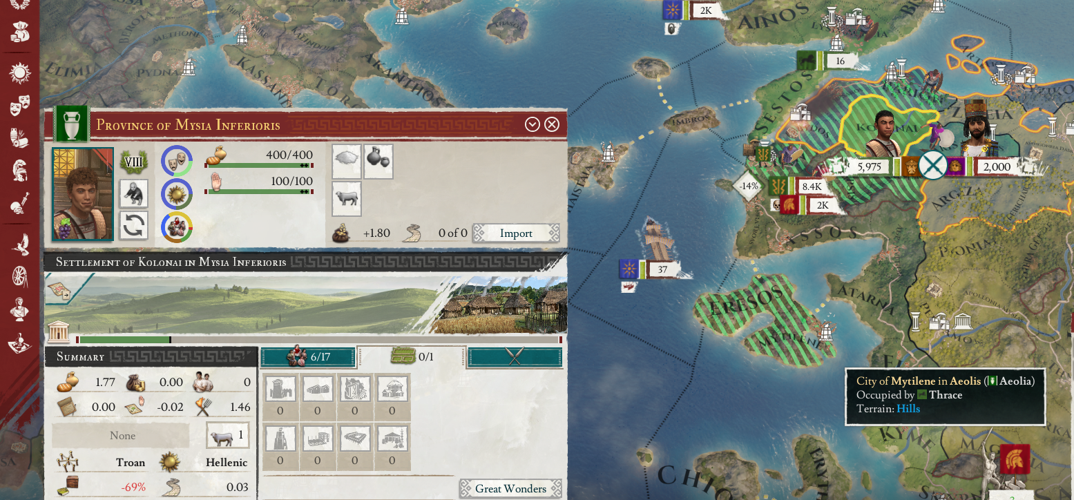
-The province and settlement I have highlighted are under my occupation, can you see it? No? That's because this information isn't displayed in the province UI!
Occupation.png


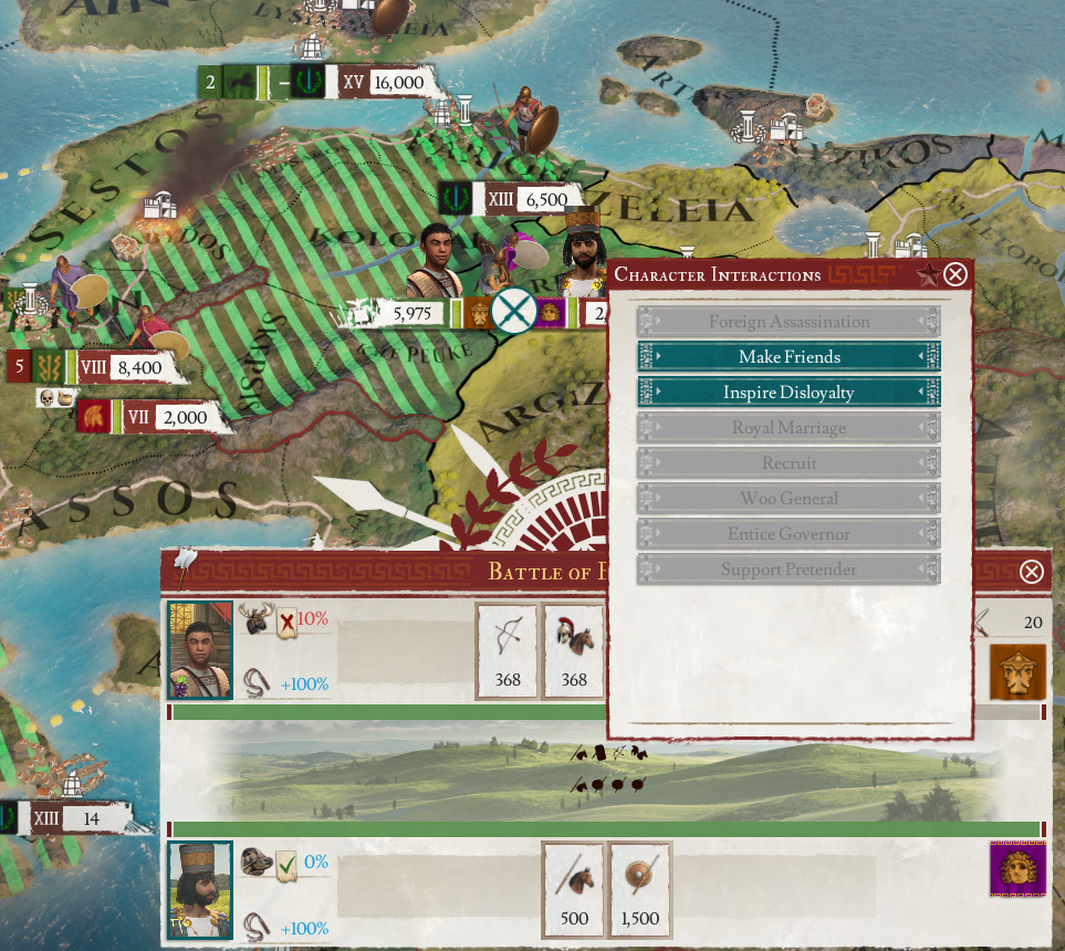
-Let's talk about battles now, having the image of the commanders is nice, what is not nice is this big pop-up that you get if you even tryto hover over the battle
battle1.png

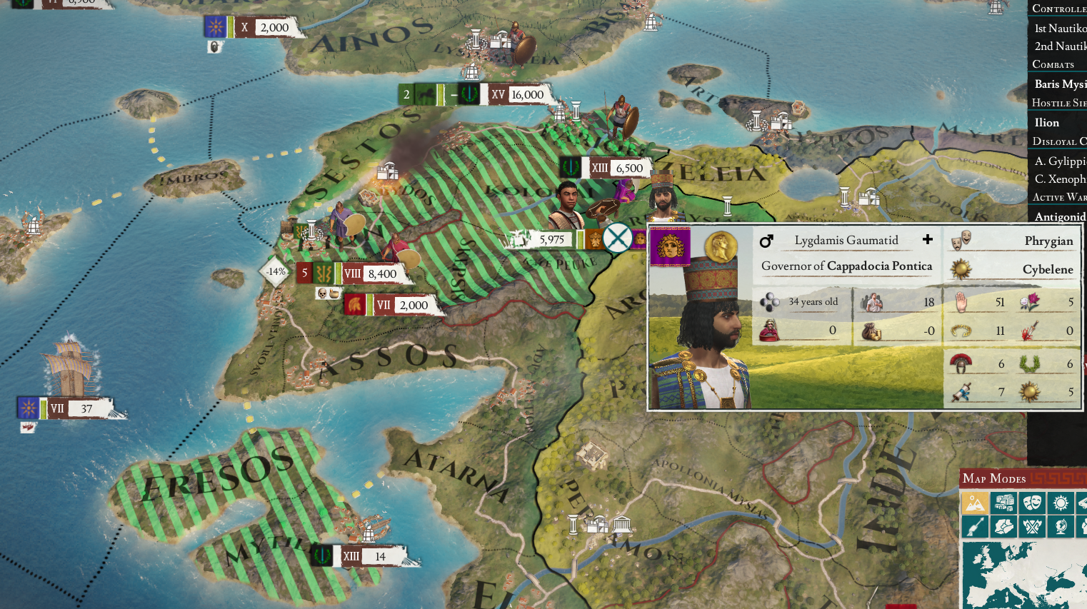
And what happens if you for example have an army selected and want to move it to that territory (presumably to aid in the battle), but over half of the territory space is occupied by this dude?

batlle2.png


You get to interact with him! Who cares, I'm trying to move armies right now!

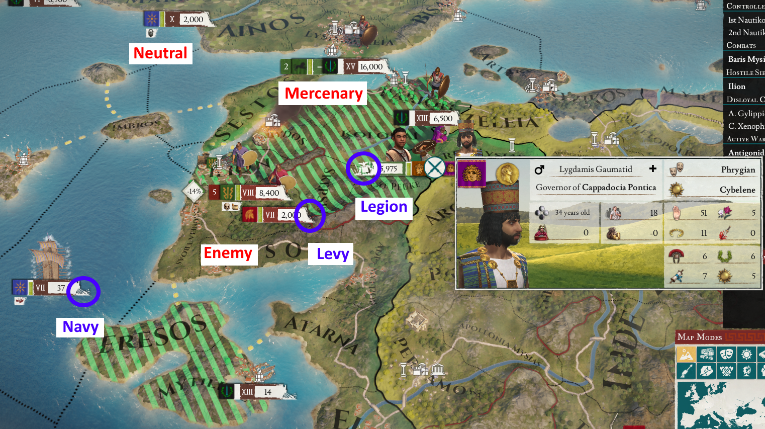
-Also let's talk about the color of the armies, there is no color distinction betweem neutrals and mercenaries AND that color is just a darker shade of the color of the ENEMY army! why are they both a shade of red?
-The symbolic distinction between unit types is also weak, navies and levies almost look the same, which can cause confusion if you have units along the coast. Legions have a very different symbol, which is the right thing to dom, but why is it pure white with no border, you can barely see that it's a banner with an eagle on top!


units.png


-And lastly for now, while nested tooltips are an amazing feature, why can I click something under them? In this case I had another inteface open, checked a tooltip and casually clicked in the black zone because nothing should happen right? Nope, I selected a random territory under the map, why are the tooltip boxes transparent?
tooltip.png


Oh yeah about tooltips, I almost forgot, have you tried keeping open the tooltip of a mission? Why is it so hard to do?
 
Last edited:
  • 20Like
  • 11
  • 6
Reactions:
-Also let's talk about the siege icon, I like it, but please it should be easier to understand!
View attachment 682306
I broadly agree with you except for in this instance. In Paradox games. whether the siege is friendly or hostile has always been indicated by the army doing the besieging, not the actual percentage ticker, which is the same for both. But that brings me to a related issue:

Why are neutral armies framed in brown-ish dark? I had a very small heart attack when I thought 18k Etruscans were knocking on my back door while I was dealing with Sabines, since the colour read to me as a hostile army.
 
  • 7
  • 2Like
Reactions:
I broadly agree with you except for in this instance. In Paradox games. whether the siege is friendly or hostile has always been indicated by the army doing the besieging, not the actual percentage ticker, which is the same for both. But that brings me to a related issue:

Why are neutral armies framed in brown-ish dark? I had a very small heart attack when I thought 18k Etruscans were knocking on my back door while I was dealing with Sabines, since the colour read to me as a hostile army.
I don't have a problem with the percent I worded it wrongly, I meant that it's barely noticeable from the background AND that no matter if it's you, an ally, an enemy or a neutral nation, the icon is literally the same for all, no color distinction.
 
  • 1Like
Reactions:
The fact that mercenaries are still generally visible on the map seems insane to me, at least make it a toggle please! They're extremely distracting and just give my poor low end pc more work to do for no gain...
 
  • 9
  • 1Like
Reactions:
Couple of things that are bothering me:

- When you go to change a researcher, the list highlights relevant traits. Cool. However, there's no way to see if the current researcher has one of these traits without going to their full profile page. Considering that the presence of those innovation generating traits is now by far the most important part of a person's suitability for the position this is a little awkward.
- It's not 100% percent necessary but it would be really nice to have a tooltip breaking down in detail how the size/composition of a levy was determined. Something like "X integrated Nobles and Citizens and Y integrated Freemen and Tribesmen with a Z% levy size generates X' advanced and Y' basic cohorts; after accounting for W legionaries we are left with X'' and Y'' levies assigned thusly..."
 
  • 14
  • 4Like
Reactions:
Couple of things that are bothering me:

- When you go to change a researcher, the list highlights relevant traits. Cool. However, there's no way to see if the current researcher has one of these traits without going to their full profile page. Considering that the presence of those innovation generating traits is now by far the most important part of a person's suitability for the position this is a little awkward.
- It's not 100% percent necessary but it would be really nice to have a tooltip breaking down in detail how the size/composition of a levy was determined. Something like "X integrated Nobles and Citizens and Y integrated Freemen and Tribesmen with a Z% levy size generates X' advanced and Y' basic cohorts; after accounting for W legionaries we are left with X'' and Y'' levies assigned thusly..."
Agree, both of these would be huge improvements.
 
You cant see clearly which governing party the 2 Consuls orginate from, you have to consistently click them to find out:
2021-02-17 11_15_37-Imperator.png

That being said I really like the new UI, it just needs tweaks to make it more accessible.
 
  • 13Like
  • 3
Reactions:
I asked this in another thread, but it has been buried, so I shall ask again here: does anyone know where province modifier icons have gone?
 
I agree with all of you. But there is even more, unacceptable stuff... I'll make a list later, not gonna bother now, I'm so disappointed. Its gonna take 1,2, 3 patches to revert all this crap, if they will even do it.
Like I can't even tell if a trade good is available. After looking closely, I see the goods are grayed out (doesn't exist) or has a green outliner (no idea what this means) . Even if the green outliner was the thing its still much harder to notice at a glance of its available. Wtf? You want me to click through every trade good to see if it's available? AND scroll bc available ones is not in Top? Unacceptable, I'm sorry but it is.
God, for me it's barly playable.
 
  • 5Like
  • 3
  • 2Haha
  • 1
Reactions:
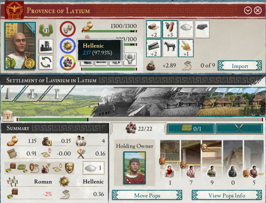
The pie charts I find to be badly executed as well - holding your mouse cursor over them should give you a full break-down (as any reasonable human being would expect). But this is not the case, it gives you info only about the part that you are holding your mouse over.

Here is an example of the pops pie chart:
cropped_1.png


Same story with the religion pie chart:
cropped_2.png


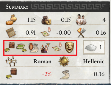
The province summary is ok for the most part, but the summary of province effects is a cluttered mess. I managed to fill the space in a span of 15 minutes:
bad_summary.png


Most of those province effects come from the province investments. Is it so hard just to have bloody counters for these province investments instead of me having to find the appropriate effect that represents the province investment I am looking for, hold my mouse over that effect, then do mental arithmetic after the tooltip pops up??? All of this just to figure out how many province investments of a specific type I have and how many I would want... Absolute and complete madness. I even wrote a suggestion months ago about this - it got ignored, of course:

2020_09_18_1.png


The more time I spend with the "new" UI the more frustrated I get. I am convinced that this is a half-baked mess that just gets in the way. It boggles my mind that the functional aspect was neglected to such a degree. What an absolute disappointment. I was looking forward to 2.0 so much. This UI just screams "I was tested by the designers/developers of the game, not actual players".

And the feature that was hyped the MOST, turns out to be the worst part of the whole damn patch. It does not matter how pretty the UI is if it is an absolute abortion in terms of functionality, control and access of information.
 
  • 15Like
  • 10
  • 1
Reactions:
Why have we got two nation overview buttons, we can click nation flag (best solution for an overview IMO) and also the banner (top icon on sidebar) fulfilling exactly the same function?

Surely, that spare icon could have been used for something else?

The province overview is a disaster, why doesn't it even tell me:

1. What those provinces are, and who owns them?

2. Whether they are cities or settlements?

3. Which trade good is being produced? (might be handy for planning a buildings run if you need x amount of farms within x province for a mission for example)

4. How many building slots do I have remaining?

All this has been taken away for no apparent reason over time, there used to be a handy pop out which gave you this info.

Suggestion: Lots of wasted real estate on the province/food icon after hovering on it, simply list all territories/cities owned or not with flag denoting ownership, then list other info listed above in owned territories/cities - ditto on Nation Overview > Provinces>Hover (where 60% of the pop out is just blank space).

The mind boggles at the thought processes at work here, it's time for beta's and letting the player-base decide on the UX/UI experience. It's cluttered in some places yet has vast swathes of blank space eslewhere, which could be utilised. The players know what info needs to be communicated and in what fashion far better than the devs do. We see of course why there was no beta, because the UI is still very WIP, and rather than accept they needed help designing it, they kept it hidden away.

It's still a unintuitive chore, and all I have been able to do as the game crashes at year end is take a look at the UI on pause, god only knows what it's like to handle during a large conflict or even in peace time as you try and manage a large empire.
 
Last edited:
  • 3
  • 2Like
Reactions:
I'm actually fine with the Roman vs. Arabic numerals (with the obvious exception of zero not being displayed) and I think the city founding button is actually pretty nice that way. I really dislike UIs that have to fit everything into buttons that clearly look like buttons.
 
  • 6
  • 1Like
  • 1Haha
  • 1
Reactions: