Elements of bad user experience from the previous UI are still present in the new one... Some of the new changes are actually a downgrade.

  • We have updated our Community Code of Conduct. Please read through the new rules for the forum that are an integral part of Paradox Interactive’s User Agreement.

KBKDB

Second Lieutenant
67 Badges
Aug 11, 2017
174
1.118
  • Crusader Kings II
  • Cities: Skylines - After Dark
  • Europa Universalis IV: Cossacks
  • Cities: Skylines - Snowfall
  • Europa Universalis IV: Mare Nostrum
  • Stellaris
  • Knights of Honor
  • Stellaris: Digital Anniversary Edition
  • Cities: Skylines Industries
  • Stellaris: Distant Stars
  • Cities: Skylines - Parklife
  • Stellaris: Galaxy Edition
  • Stellaris: Humanoids Species Pack
  • Hearts of Iron IV: Expansion Pass
  • Stellaris: Galaxy Edition
  • Hearts of Iron IV: Cadet
  • Crusader Kings II: Reapers Due
  • Europa Universalis IV: Rights of Man
  • Crusader Kings II: Jade Dragon
  • Stellaris: Leviathans Story Pack
  • Cities: Skylines - Natural Disasters
  • Hearts of Iron IV: Together for Victory
  • Crusader Kings II: Monks and Mystics
  • Stellaris - Path to Destruction bundle
  • Cities: Skylines - Mass Transit
  • Hearts of Iron IV: Death or Dishonor
  • Stellaris: Megacorp
  • Cities: Skylines - Green Cities
  • Stellaris: Ancient Relics
  • Hearts of Iron IV: No Step Back
  • Stellaris: Nemesis
  • Stellaris: Necroids
  • Battle for Bosporus
  • Crusader Kings III
  • Imperator: Rome - Magna Graecia
  • Stellaris: Federations
  • Hearts of Iron IV: La Resistance
  • Europa Universalis IV
  • Stellaris: Lithoids
  • Crusader Kings II: Conclave
  • Cities: Skylines - Campus
  • Hearts of Iron IV: Expansion Pass
  • Imperator: Rome Deluxe Edition
  • Cities: Skylines
  • Crusader Kings II: Holy Fury
  • Europa Universalis IV: El Dorado
  • Crusader Kings II: Way of Life
  • Europa Universalis IV: Common Sense
  • Crusader Kings II: Horse Lords
  • Stellaris: Apocalypse
Hear me out on this. I love the work the developers have done on the 2.0 update, but there are a lot of missed opportunities with the new UI. More specifically, to remedy the drawbacks of the previous UI which would improve the user experience. The worst part about it is that it is incredibly simple but obvious (to me as a player) stuff.

The purpose of an UI is ultimately to provide control and convey information to the player. While I appreciate the new art, there are various UI elements that are handled in an incredibly nonsensical and counter-intuitive way. These shortcomings just ruined the experience before and continue to ruin the experience now. I have seen them get brought up before, but ultimately these suggestions just did not make their way into the game. With that being said, let me delve into the specifics and show you what I mean.

With the new update there are limits on some buildings and this is communicated in the tooltip. Other buildings however have to be researched. How is the information about what needs to be researched in order for a building to become available communicated to the player. Is it in conveyed in an intuitive manner? Absolutely not. Your first instinct as a player is to hold your mouse cursor over the BUILDING ICON which will hopefully contain such information, right? Wrong.

859580_20210216205654_1.png


Do you see any mention of why I can not build a Great Temple? Such information is nowhere to be seen. Instead, this vital piece of information is separated into another tooltip in the most counter-intuitive way imaginable - you have to hold your mouse cursor over the building counter.....

859580_20210216205716_1.png


The same story when I try to import trade resources. My initial intuition is to hold the mouse cursor over the RESOURCE ICON only for absolutely nothing to happen...

859580_20210216210015_1.png


Of course, you have to hold your mouse cursor over the name instead...

859580_20210216210020_1.png


And I wish that these were my only gripes but they are not. The game is full of annoying cases similar to what I pointed out above. And this does not even include obviously stupid decisions like making it hard to distinguish which resources are available for import or not (this tiny cyan highlight barely does anything, I am sorry) or having green modifier numbers against a Cyan background, making it an absolutely cancerous experience to read/decipher.

I urge other players to give similar specific examples as well. I thought they were painfully obvious but apparently not. A pretty UI only goes so far - it must be functional.

Why do I have to feel like I am fighting the UI? It makes absolutely no sense to me.

In some aspects, the UI is actually a downgrade. A good example is the option to upgrade a city... Why is it hidden away? You can click on the settlement/city section of the art but not on the terrain one... If something looks and feels like a button, then there is a good chance that the player will attempt to click it. The option to upgrade a city is presented as background art, yet the player has to guess and treat it like a button that opens up hidden options. Incredibly frustrating.

859580_20210216205815_1.png


You know a UI feature is bad when players have to post on the forums to ask how to do certain things:
 
Last edited:
  • 56Like
  • 40
  • 9
  • 4
Reactions:
Agreed on all counts, those are definitely UX issues and should be addressed.

As to why they were present in 2.0? Who knows, I doubt we'll ever get an answer to that.
Think of them as UX bugs.
Hopefully they'll get fixed on the next major patch; it would be a pleasant surprise if they get fixed sooner.
 
  • 8
  • 1Like
Reactions:
PDS once again very poor in communicating changes and information. Changing the UI means you also have to tell people how the new UI works, and how infomation can be obtained, not leave it for the user to spending hours working everything out. Still as the game crashes at Dec 31st, figuring out the new UI is about all I can do...
 
  • 7
  • 1Like
  • 1
Reactions:
Agreed OP, hopefully Paradox will be quick on addressing these sorts of UI / UX issues and won't just sit on them for months. I think the new UI is significantly better but it is awkward that you really do have to put in a lot of effort to find sone pieces of information or buttons.
 
  • 4
  • 2Like
Reactions:
Added some more info in the original post, keep in mind I am not a "hater", I love the game. I appreciate the work the developers have done. I even bought the new DLC as soon as it became available.

I would not have taken the time and effort to point out exactly what bugs me if I simply wanted to bash the developers.

With that being said, with how long the patch has been in development and how far the game has come, I do expect an adequate level of polish.
 
  • 8Like
Reactions:
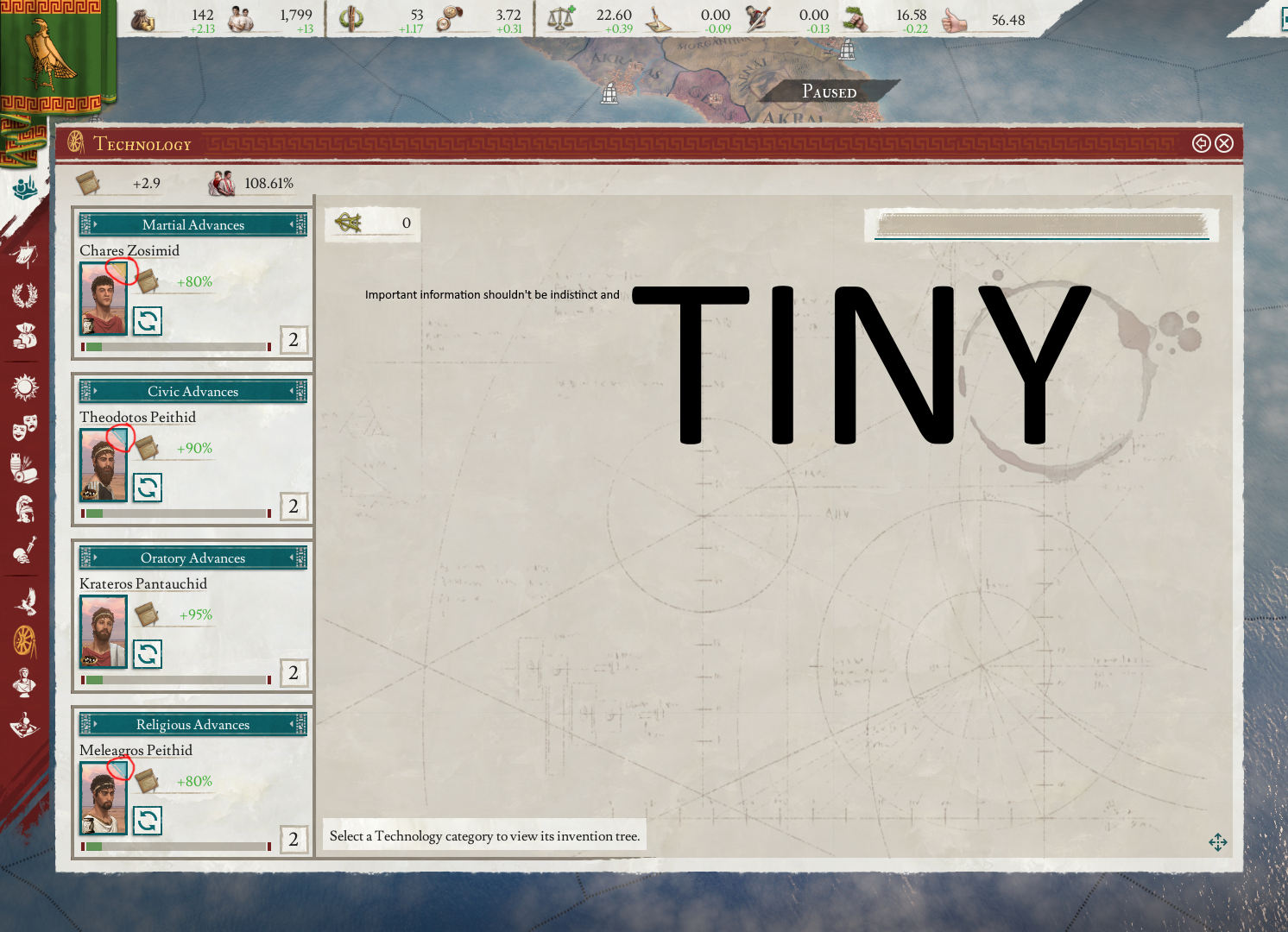
I don't like the way 'levels' are placed over the skill icons, it's kinda hard to read.

Here's the military screen as an example:

1613514163965.png


Screenshot taken from YouTube, I'm a GOG plebeian.
 
  • 13Like
  • 8Haha
  • 6
  • 1
Reactions:
whats with all the 5.00 1.00 10.00 100.00 everywhere? Why not just remove the .00 and make the interface cleaner? Why do they keep trying to replace actual words with icons that don't mean much to a newer player (I'm looking at you political influence)?
 
  • 13
  • 3Like
Reactions:
I don't like the way 'levels' are placed over the skill icons, it's kinda hard to read.

Here's the military screen as an example:

View attachment 682127

Screenshot taken from YouTube, I'm a GOG plebeian.
I don't mind the numbers and I found the tab to change a cities status really fast.

My personal 2 issues is how characters that are a part of a major family has a small colored corner. Colors such as green and blue that blend heavily into the background and it makes me feel really bad for the color blind people who play this. That and that trade goods now no longer has the check mark if a nation is willing to trade you in a certain resource. So most of the time I go through the trade menu it's trying to find a trade good that a nation is willing to trade.

The new UI has it's issues. I'll agree with that whole heartedly. But in the end...I will have to say overall it's much better than the old one.
 
Last edited:
  • 21
  • 9Like
  • 1
Reactions:
Oh lord, this is going to be quite a list.....

Here's a start:

1) The 'Action Lock' tooltip mode doesn't work properly; seems completely arbitrary whether pressing MMB locks the tooltip or not.

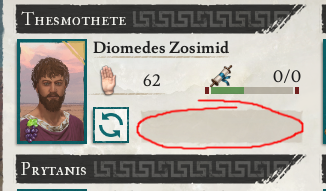
2) If you have an Office position occupied by a character with zero effective skill, the modifier related to that Office position is completely omitted.
This means there's absolutely no way of finding out what modifier said office would otherwise give.
This issue is further compounded by the effective/peak mechanic, making zero skill much more common.

1613516583039.png


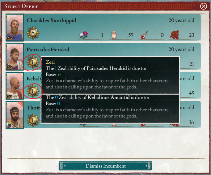
3) 0 skill, and 1 skill, have the same icon.

1613516868845.png


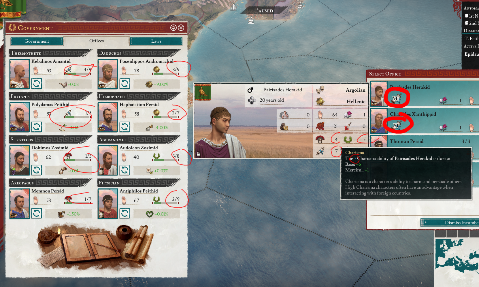
4) Roman Numerals on this one screen; Arabic numerals everywhere else?? WTFacepalm?!?

1613517173729.png


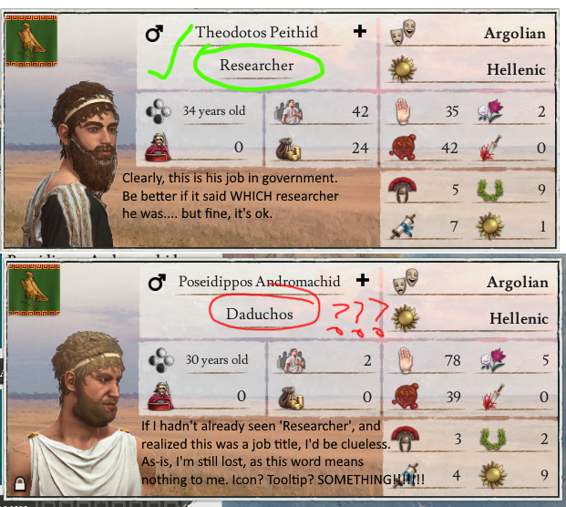
5) Character jobs lack symbology , or tooltips, and have obscure names that mean nothing to 95% of players.

1613517654652.png


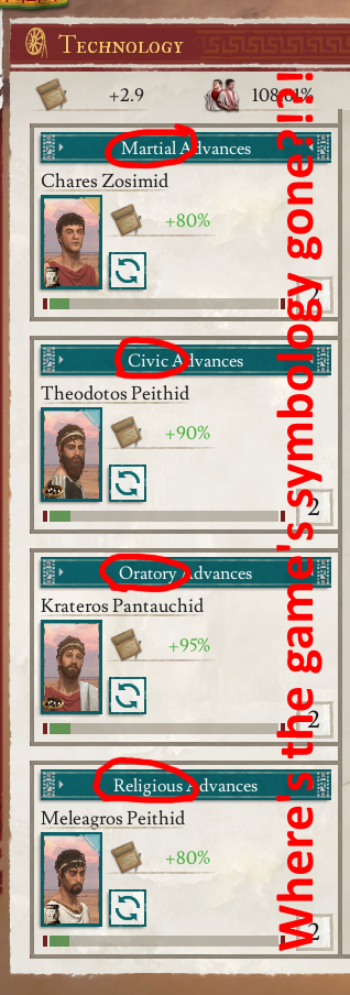
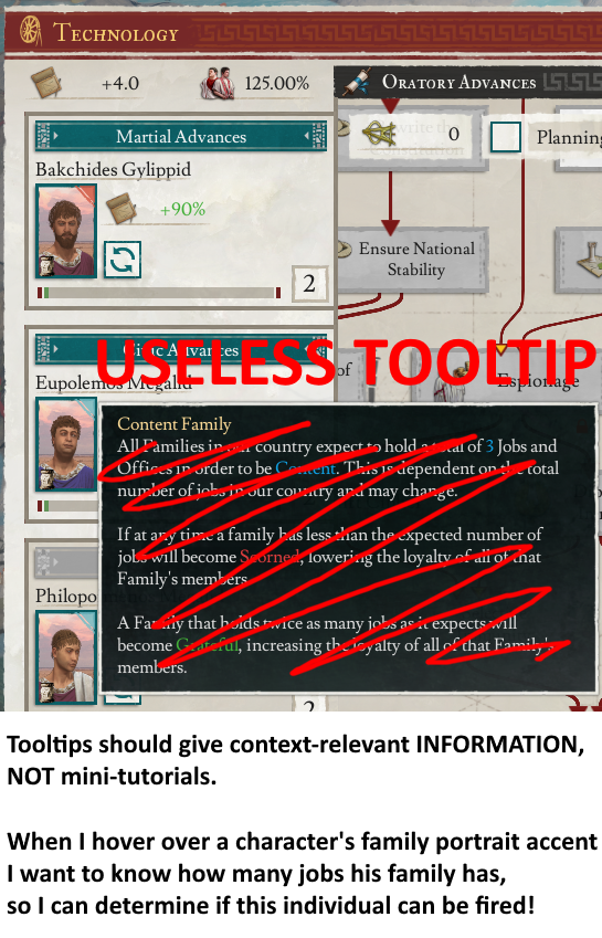
6) Great Families are a vital gameplay mechanic that needs to be kept in mind whenever placing characters in jobs.
You shouldn't relegate such vital information to indistinct & tiny portrait accents.
1613518009450.png


7) The game has established a lexicon of symbols for various character traits, yet in numerous places you aren't using them. e.g.

1613518327467.png


8) Character sheets do not properly emphasis the important information.
1613519840672.png
 
Last edited:
  • 45
  • 17Like
  • 7
  • 1Love
  • 1
Reactions:
Oh lord, this is going to be quite a list.....

Here's a start:

1) The 'Action Lock' tooltip mode doesn't work properly; seems completely arbitrary whether pressing MMB locks the tooltip or not.

2) If you have an Office position occupied by a character with zero effective skill, the modifier related to that Office position is completely omitted.
This means there's absolutely no way of finding out what modifier said office would otherwise give.
This issue is further compounded by the effective/peak mechanic, making zero skill much more common.

View attachment 682145

3) 0 skill, and 1 skill, have the same icon.

View attachment 682149

4) Roman Numerals on this one screen; Arabic numerals everywhere else?? WTFacepalm?!?

View attachment 682153

5) Character jobs lack symbology , or tooltips, and have obscure names that mean nothing to 95% of players.

View attachment 682156

6) Great Families are a vital gameplay mechanic that needs to be kept in mind whenever placing characters in jobs.
You shouldn't relegate such vital information to indistinct & tiny portrait accents.
View attachment 682160

7) The game has established a lexicon of symbols for various character traits, yet in numerous places you aren't using them. e.g.

View attachment 682165

8) Character sheets do not properly emphasis the important information.
View attachment 682178

All of these examples are an excellent representation of what really grinds my gears. Why bother making the UI so pretty if you are going to make so many functional downgrades?

I really do hope these things get addressed - I have no idea how any of this got approved and passed QA. The random use of Roman Numeral makes absolutely no sense from a gameplay perspective. I get it, the game is in a Roman setting, does not mean that is how I want information to be conveyed to me. This should be a customisable option at the very MINIMUM. Why do you enforce it on me? Roman Numeral here, Arabic Numeral there... I am sorry, but this is beyond silly and achieves nothing but confusion and inconsistency.

Also the family markings on character portraits was objectively better and easier to read at a glance in the previous iteration of the game. Who in their right mind thought that having small Cyan/Blue family markings on character portraits which have a sky as a major part of the portrait background was a good idea?

And this is why I will never stop screaming about an open beta. Waited months for this only to discover these non-sensical changes 5-10 minutes into the game. What makes it even worse is that the mechanics and gameplay improvements in 2.0 are there and they are good. It is beyond ridiculous that I now have to wrestle with a supposedly "improved" UI that is functionally a downgrade in many aspects.

Yes there are good changes. But after so many months of waiting I had hopes for an improvement across the board, not a mixed bag when it comes to the UI.
 
Last edited:
  • 11
  • 5Like
Reactions:
Here's another one.

Maybe I'm being a bit dim..... but, as far as I can tell, the actual numerical Civilization Value of a province isn't displayed ANYWHERE?!

The tooltip shows me all the modifiers (in an extremely obtuse, confusing & unhelpful way), along with the maximum value, the rate of change, and even how the rate of change is derived..... but it doesn't actually show me the current value?!

I'm presuming the value is being represented as that vague green bar just above the 'Summary' ?

1613524708181.png


There is of course, a second tooltip.... (I won't repeat myself as to why splitting intimately linked information across two tooltips is a bad idea).
However, this second tooltip doesn't give the actual Civilization Value either.

1613525003556.png


p.s.

More of those bloody Roman numerals to pointlessly obfuscate the UI.
 
  • 22Like
  • 9
  • 3
Reactions:
Maybe I'm being a bit dim..... but, as far as I can tell, the actual numerical Civilization Value of a province isn't displayed ANYWHERE?!
I'm probably just used to poorly-designed Paradox UIs, so I don't notice most of these very real UI issues.

But this one is really baffling to me, and I noticed it in my playthrough right away. I'm trying to find out what the civilization value of a province is, and I can't do it within the province menu?!

The solution was to switch to the civilization map mode and hover over the province, but that's just such a roundabout way of doing things that it can't be the intended solution...
 
  • 8Like
  • 2
Reactions:
I'm probably just used to poorly-designed Paradox UIs, so I don't notice most of these very real UI issues.

But this one is really baffling to me, and I noticed it in my playthrough right away. I'm trying to find out what the civilization value of a province is, and I can't do it within the province menu?!

The solution was to switch to the civilization map mode and hover over the province, but that's just such a roundabout way of doing things that it can't be the intended solution...

What makes it even worse is the fact that Civilisation value is more important than ever with the changes in 2.0.
 
  • 3
  • 1Like
Reactions:
1613527572083.png


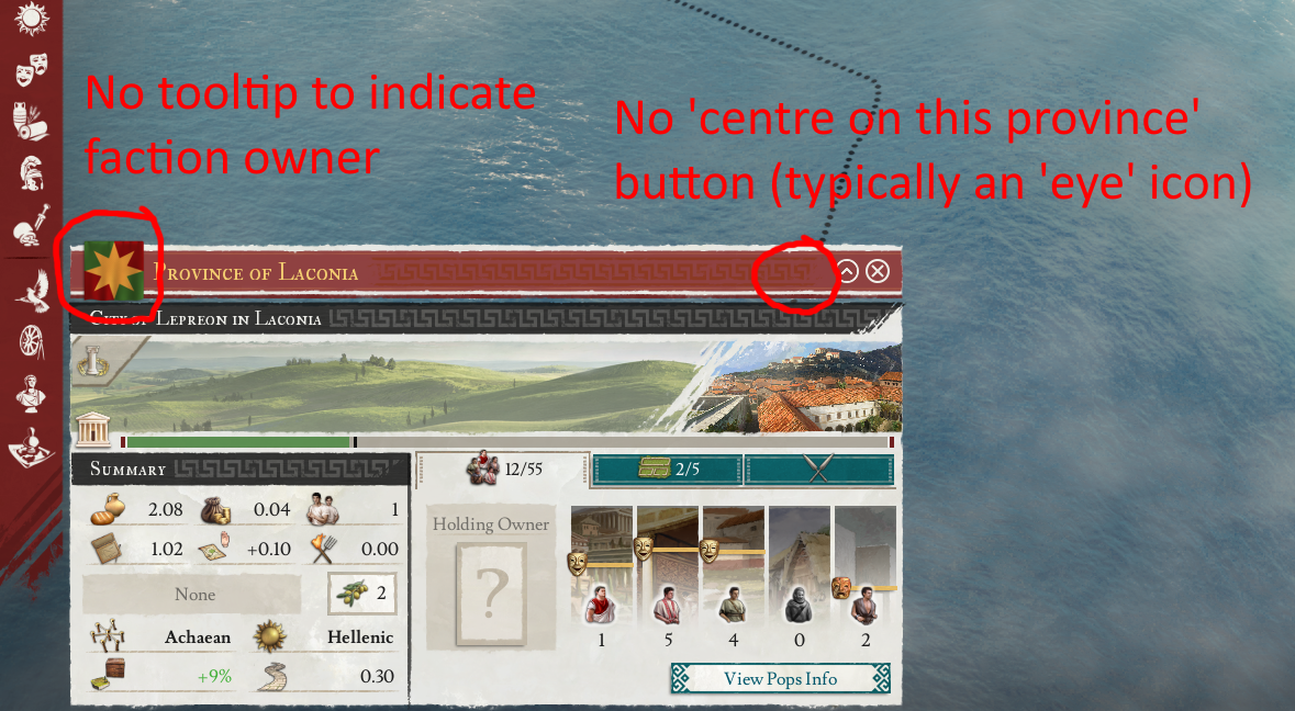
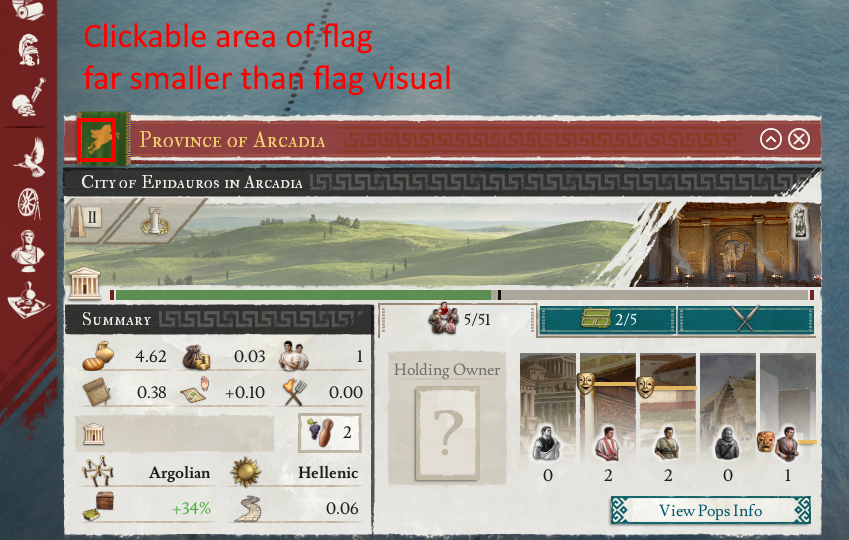
I bet everyone has tried to click a province flag, only to have the click be mis-registered as a click on the province banner. (causing the Governor/demographics/trade details banner to be displayed instead)
 
  • 31Like
  • 4
  • 4
Reactions:
1613528165282.png


The numerousness of these glaring issues really makes me question whether the Imperator development team actually play their own game.
Or maybe their QA team is just shiz.
 
  • 24Like
  • 20
  • 4
  • 2
  • 1Love
Reactions:
This thread help a lot, not finding the city build button was not my only issue. Not being able to build because the tool tip to explain you need to research it ,is hidden was another problem.

The research panel is horrible by the way . First time you open it,you get a window, why not using the full screen ? Why reinvent the wheel , do it like civilization!
Then there's nothing at all on the right , several people are already lost there . Once you find out you need to click on each advisor on the left , you are unable to see it all and struggle with it again.
To navigate it you need to use the middle mouse button to move . How to know that ? By hoovering the mouse cursor on the small cross at the bottom right, that will tell you so...
As for level of province civilisation i have not found it anywhere.

The trade ? A chore, you click goods one by one hoping its even possible to establish a trade route, each good button should be greyed if its impossible.Then its only trading with outside nations, as far i understand it to trade with your own provinces, its only using the building tool on the top left of the screen.Why make it separate ? Thats another mystery.
 
  • 9Like
  • 4
Reactions:
I like the new ai, and i dont have a problem myself with the build city stuff button. I did find the none listing of the civimiaztion number odd. And yabthe buildings such as foundry having to hover the building number to see how to build is wierd. Anyway ya there are a few issues that hopefully they work on.
 
Hear me out on this. I love the work the developers have done on the 2.0 update, but there are a lot of missed opportunities with the new UI. More specifically, to remedy the drawbacks of the previous UI which would improve the user experience. The worst part about it is that it is incredibly simple but obvious (to me as a player) stuff.

The purpose of an UI is ultimately to provide control and convey information to the player. While I appreciate the new art, there are various UI elements that are handled in an incredibly nonsensical and counter-intuitive way. These shortcomings just ruined the experience before and continue to ruin the experience now. I have seen them get brought up before, but ultimately these suggestions just did not make their way into the game. With that being said, let me delve into the specifics and show you what I mean.

With the new update there are limits on some buildings and this is communicated in the tooltip. Other buildings however have to be researched. How is the information about what needs to be researched in order for a building to become available communicated to the player. Is it in conveyed in an intuitive manner? Absolutely not. Your first instinct as a player is to hold your mouse cursor over the BUILDING ICON which will hopefully contain such information, right? Wrong.

View attachment 682082

Do you see any mention of why I can not build a Great Temple? Such information is nowhere to be seen. Instead, this vital piece of information is separated into another tooltip in the most counter-intuitive way imaginable - you have to hold your mouse cursor over the building counter.....

View attachment 682088
Yes, that one in particular is obnoxious.