Hello! Rich here, I’m Lead Concept Designer at Triumph and responsible for a lot of the visual aspects of the game. For this weeks dev diary I’ll be talking about the development of the Key Art, and game Logo.
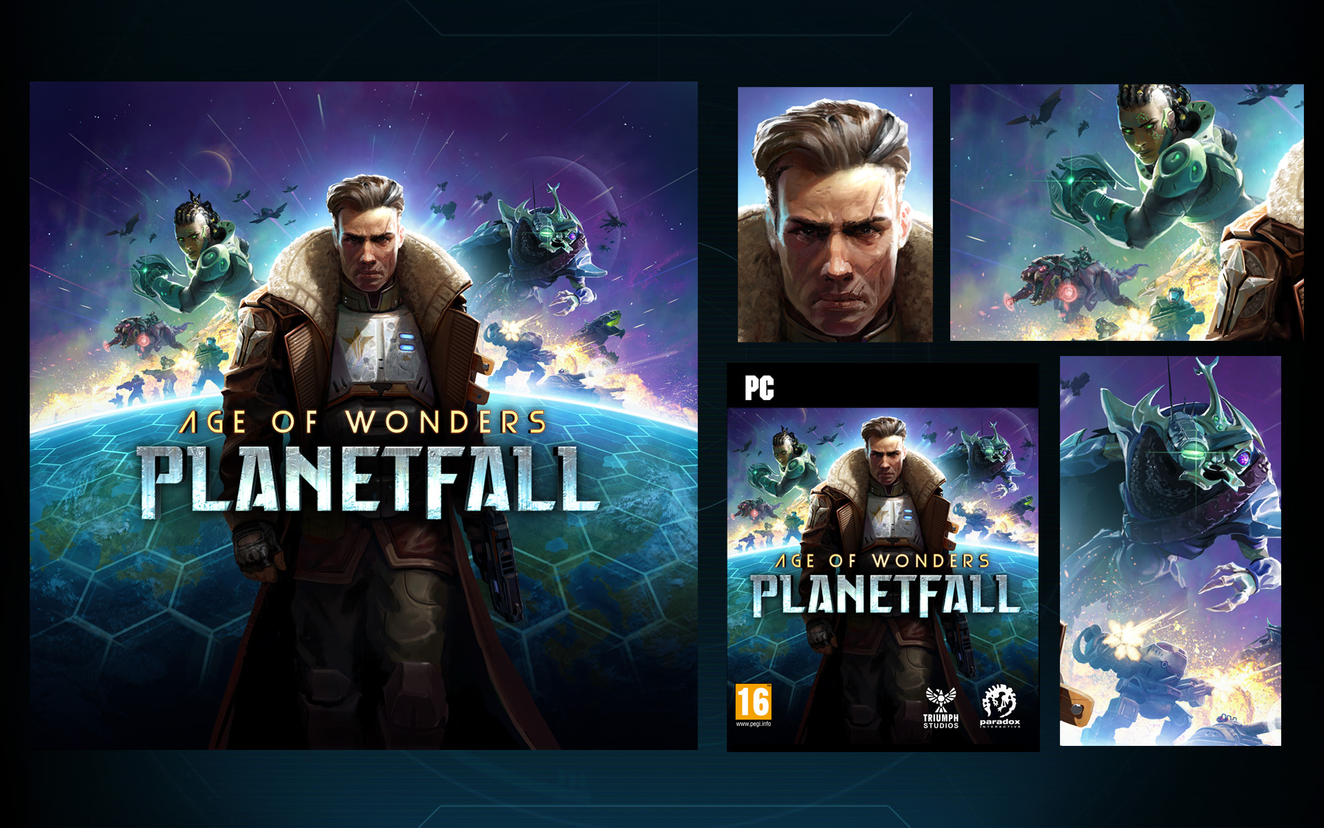
The key Art is an important part of a games branding and should tell people who’ve never seen nor heard of the game before what it’s about. This is especially true for new IP’s such as PlanetFall. It should solidify the games tone in one image as well as grab the attention on store shelves making you want to know more. Additionally it should adhere to strict formatting guidelines so it can be cut up for many different assets; box art, steam cells, posters etc. making the composition a tricky thing.
But essentially we wanted to answer 2 basic questions with the key art -
1. Who am I?
2. What do I do?
Answer – I’m a cool sci-fi hero fighting over a planet with different types of units under my command.
Now that we have our focus, we need to decide on the visual hierarchy. What races and units to show, their posing, the lighting and composition, how should the planet look, where should the logo be placed. Everything is a visual puzzle that needs solving.
From the get go we knew we wanted the Vanguard hero Jack front and center, humans are interestingly the most played race, the human eye always looks for faces and this would be vital to setting the ‘hero’ tone. If we used something more unusual like a Dvar or Kir'Ko hero it would be much harder to communicate expression. Jack's pose would go through several iterations which I’ll get to later.
Below we see some examples from other Age of Wonders games, they tend towards the warm hues but with PlanetFall we wanted to take the colour palette towards cyan, the game is very colourful and the cover should represent this. I then did rough sketches with different poses, races (sorry, no Syndicate or Assembly here!) and compositions, for example the image far right is inspired by the angles and differently scaled characters found in Star Wars posters.

After going through several quick iterations it became apparent that it was starting to feel too much like a game set in Space (Stellaris) as opposed to a planetary game. More focus on units fighting on/around the planet would help push this point. The star of the Logo was also getting in the way of the characters, we decided to implement it in other ways such as a patch on Jacks arm, and on his chest armour. Another issue was that having all the heroes in dynamic poses meant the key art was becoming hard to read, they were creating a lot of visual noise and tangents. In light of this we decided to simplify Jack’s pose, this created visual rest then play up the action and dynamics behind him, that way the eye travels around taking everything in in stages as opposed to getting lost.
We made a rough pose and lighting set up in the 3D package Maya, I then used this render as a base to paint over in Photoshop. We used angled stark lighting, that way the static pose still had movement and popped from the background. From here it was just a lot of painting and tweaking, getting harmonious colour and clear silhouettes (art tip1: explosions tip2: they were created using photos of fried chicken)

The final grizzled war Veteran Jack, surrounded by controlled chaos, I hope you like it! Is that a space dinosaur with laser guns I see there? Hmmm…

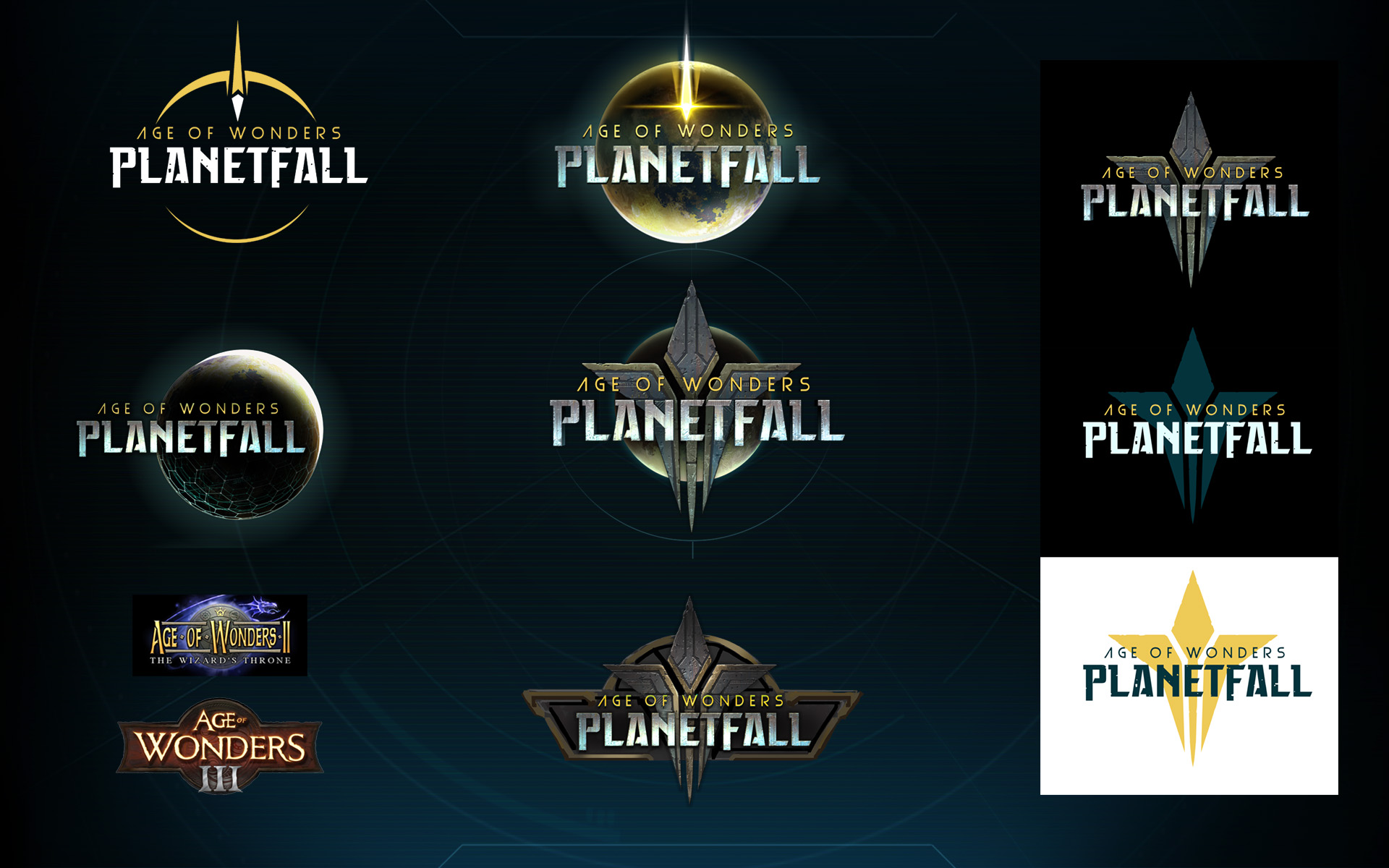
Game development is one giant iterative process, like we saw with the Key Art and the Logo is no different. The name of the game changed a few times during the development and with it the exploration and tone of the Logo. I made a lot of iterations, what you see below is a small taste of those different directions.
Early on I tried a more retro direction, almost like ‘patches’ that you would see on a baseball cap or T-shirt, and from there developed different star shapes. These star shapes went on to form the basis of a larger shape language that can be seen in units, environments and structures throughout the world, helping ground it as one empire. This became the Star Union and the main game Logo.
These early sketches are super helpful to shine a light on the right tone to take. Although our game has retro elements, it has a more serious undertone of fallen empires and big sci-fi questions, so we took the star as a basis of that fallen empire and iterated on it further. That’s not to say that the other explorations are thrown away. I’ve reused a lot of the initial designs and repurposed them as corporate brands that existed long ago, or as Mod Template Icons so you can still customize your squad into retro action heroes.

The next phase was font and logo treatment, what mood should it give? I took the star and made it appear old and worn, something very inspirational and celestial in decay. This was a nice contrast and fit the game world perfectly. We used this aged metal look throughout the interface design too, you might not consciously notice it but these elements push the sci-fi mythic aspect of our game.
Additionally we tried exploring a circular motif, something that can be seen back in our earlier Age of Wonders games. We ended up making the ‘Age of Wonders’ text golden, to tie PlanetFall to its fantasy counterpart.

Eventually we arrived at the final ominous PlanetFall and star union logo, greeting you every time you bootup -

The key Art is an important part of a games branding and should tell people who’ve never seen nor heard of the game before what it’s about. This is especially true for new IP’s such as PlanetFall. It should solidify the games tone in one image as well as grab the attention on store shelves making you want to know more. Additionally it should adhere to strict formatting guidelines so it can be cut up for many different assets; box art, steam cells, posters etc. making the composition a tricky thing.
But essentially we wanted to answer 2 basic questions with the key art -
1. Who am I?
2. What do I do?
Answer – I’m a cool sci-fi hero fighting over a planet with different types of units under my command.
Now that we have our focus, we need to decide on the visual hierarchy. What races and units to show, their posing, the lighting and composition, how should the planet look, where should the logo be placed. Everything is a visual puzzle that needs solving.
From the get go we knew we wanted the Vanguard hero Jack front and center, humans are interestingly the most played race, the human eye always looks for faces and this would be vital to setting the ‘hero’ tone. If we used something more unusual like a Dvar or Kir'Ko hero it would be much harder to communicate expression. Jack's pose would go through several iterations which I’ll get to later.
Below we see some examples from other Age of Wonders games, they tend towards the warm hues but with PlanetFall we wanted to take the colour palette towards cyan, the game is very colourful and the cover should represent this. I then did rough sketches with different poses, races (sorry, no Syndicate or Assembly here!) and compositions, for example the image far right is inspired by the angles and differently scaled characters found in Star Wars posters.

After going through several quick iterations it became apparent that it was starting to feel too much like a game set in Space (Stellaris) as opposed to a planetary game. More focus on units fighting on/around the planet would help push this point. The star of the Logo was also getting in the way of the characters, we decided to implement it in other ways such as a patch on Jacks arm, and on his chest armour. Another issue was that having all the heroes in dynamic poses meant the key art was becoming hard to read, they were creating a lot of visual noise and tangents. In light of this we decided to simplify Jack’s pose, this created visual rest then play up the action and dynamics behind him, that way the eye travels around taking everything in in stages as opposed to getting lost.
We made a rough pose and lighting set up in the 3D package Maya, I then used this render as a base to paint over in Photoshop. We used angled stark lighting, that way the static pose still had movement and popped from the background. From here it was just a lot of painting and tweaking, getting harmonious colour and clear silhouettes (art tip1: explosions tip2: they were created using photos of fried chicken)

The final grizzled war Veteran Jack, surrounded by controlled chaos, I hope you like it! Is that a space dinosaur with laser guns I see there? Hmmm…

Game development is one giant iterative process, like we saw with the Key Art and the Logo is no different. The name of the game changed a few times during the development and with it the exploration and tone of the Logo. I made a lot of iterations, what you see below is a small taste of those different directions.
Early on I tried a more retro direction, almost like ‘patches’ that you would see on a baseball cap or T-shirt, and from there developed different star shapes. These star shapes went on to form the basis of a larger shape language that can be seen in units, environments and structures throughout the world, helping ground it as one empire. This became the Star Union and the main game Logo.
These early sketches are super helpful to shine a light on the right tone to take. Although our game has retro elements, it has a more serious undertone of fallen empires and big sci-fi questions, so we took the star as a basis of that fallen empire and iterated on it further. That’s not to say that the other explorations are thrown away. I’ve reused a lot of the initial designs and repurposed them as corporate brands that existed long ago, or as Mod Template Icons so you can still customize your squad into retro action heroes.

The next phase was font and logo treatment, what mood should it give? I took the star and made it appear old and worn, something very inspirational and celestial in decay. This was a nice contrast and fit the game world perfectly. We used this aged metal look throughout the interface design too, you might not consciously notice it but these elements push the sci-fi mythic aspect of our game.
Additionally we tried exploring a circular motif, something that can be seen back in our earlier Age of Wonders games. We ended up making the ‘Age of Wonders’ text golden, to tie PlanetFall to its fantasy counterpart.

Eventually we arrived at the final ominous PlanetFall and star union logo, greeting you every time you bootup -


