Are there any official plans for a Dark UI toggle?

  • We have updated our Community Code of Conduct. Please read through the new rules for the forum that are an integral part of Paradox Interactive’s User Agreement.

Pancakelord

Lord of Pancakes
43 Badges
Apr 7, 2018
3.374
12.267
  • Cities: Skylines - Green Cities
  • Stellaris: Leviathans Story Pack
  • Cities: Skylines - Natural Disasters
  • Hearts of Iron IV: Together for Victory
  • Stellaris: Ancient Relics
  • Cities: Skylines - Mass Transit
  • Surviving Mars
  • Hearts of Iron IV: Death or Dishonor
  • Imperator: Rome
  • Stellaris: Digital Anniversary Edition
  • Hearts of Iron IV: Expansion Pass
  • Stellaris: Humanoids Species Pack
  • Stellaris: Apocalypse
  • Cities: Skylines - Parklife
  • Stellaris: Distant Stars
  • Shadowrun Returns
  • Cities: Skylines Industries
  • Imperator: Rome Deluxe Edition
  • Cities: Skylines - After Dark
  • Stellaris: Nemesis
  • Europa Universalis IV
  • Stellaris: Necroids
  • Crusader Kings III
  • War of the Roses
  • Cities: Skylines
  • Stellaris: Federations
  • Magicka: Wizard Wars Founder Wizard
  • Cities: Skylines - Snowfall
  • Stellaris: Lithoids
  • Stellaris: Galaxy Edition
  • Stellaris: Galaxy Edition
  • Stellaris: Galaxy Edition
  • Hearts of Iron IV: Cadet
  • Hearts of Iron IV: Colonel
  • Stellaris - Path to Destruction bundle
  • Stellaris: Megacorp
  • Stellaris: Synthetic Dawn
  • Crusader Kings II
  • Stellaris
  • Cities: Skylines Deluxe Edition
  • Sword of the Stars II
  • March of the Eagles
  • Darkest Hour
Title. I like the new version of Imperator, its not a time period I typically get too excited over, but it's interesting.

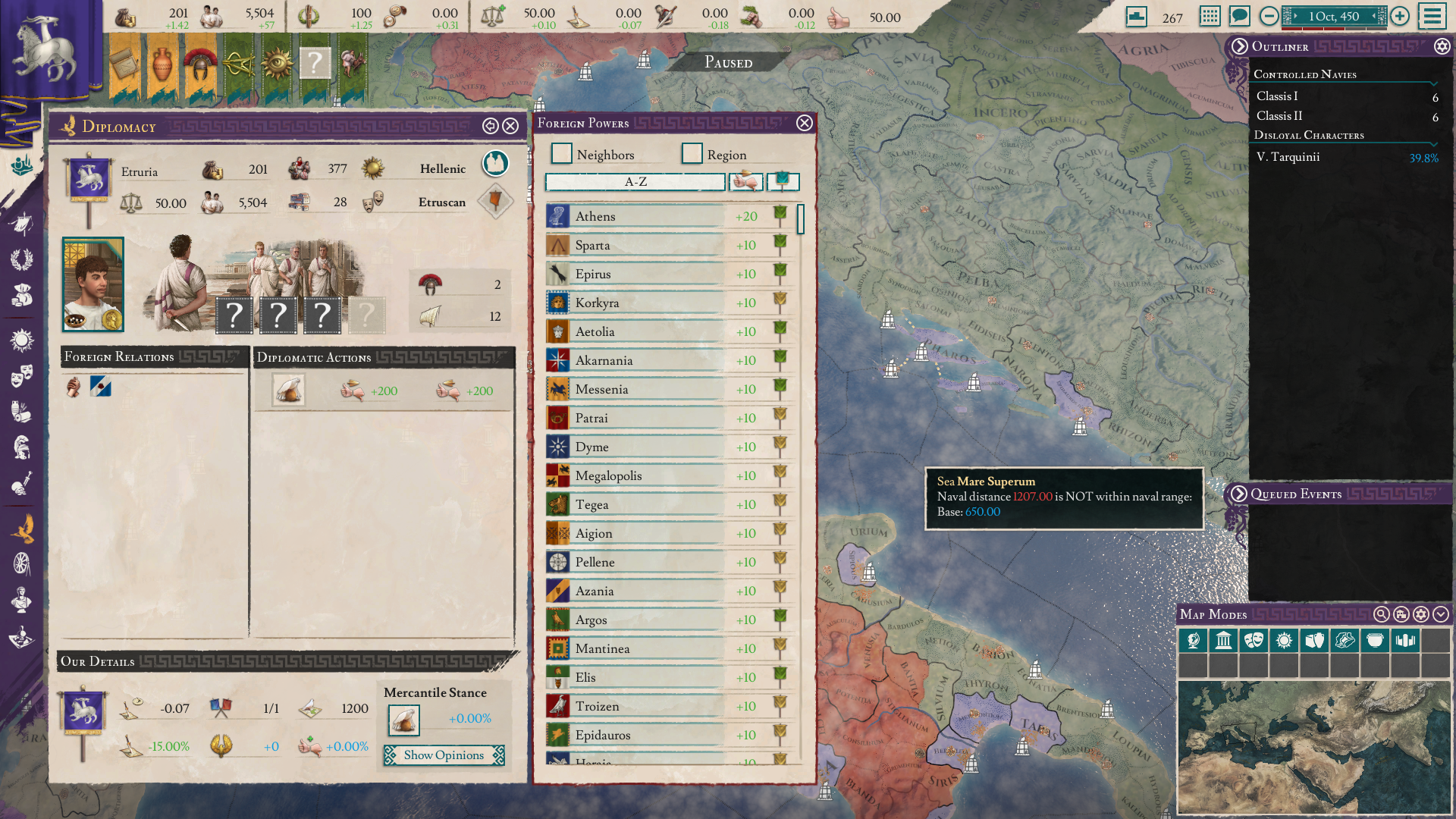
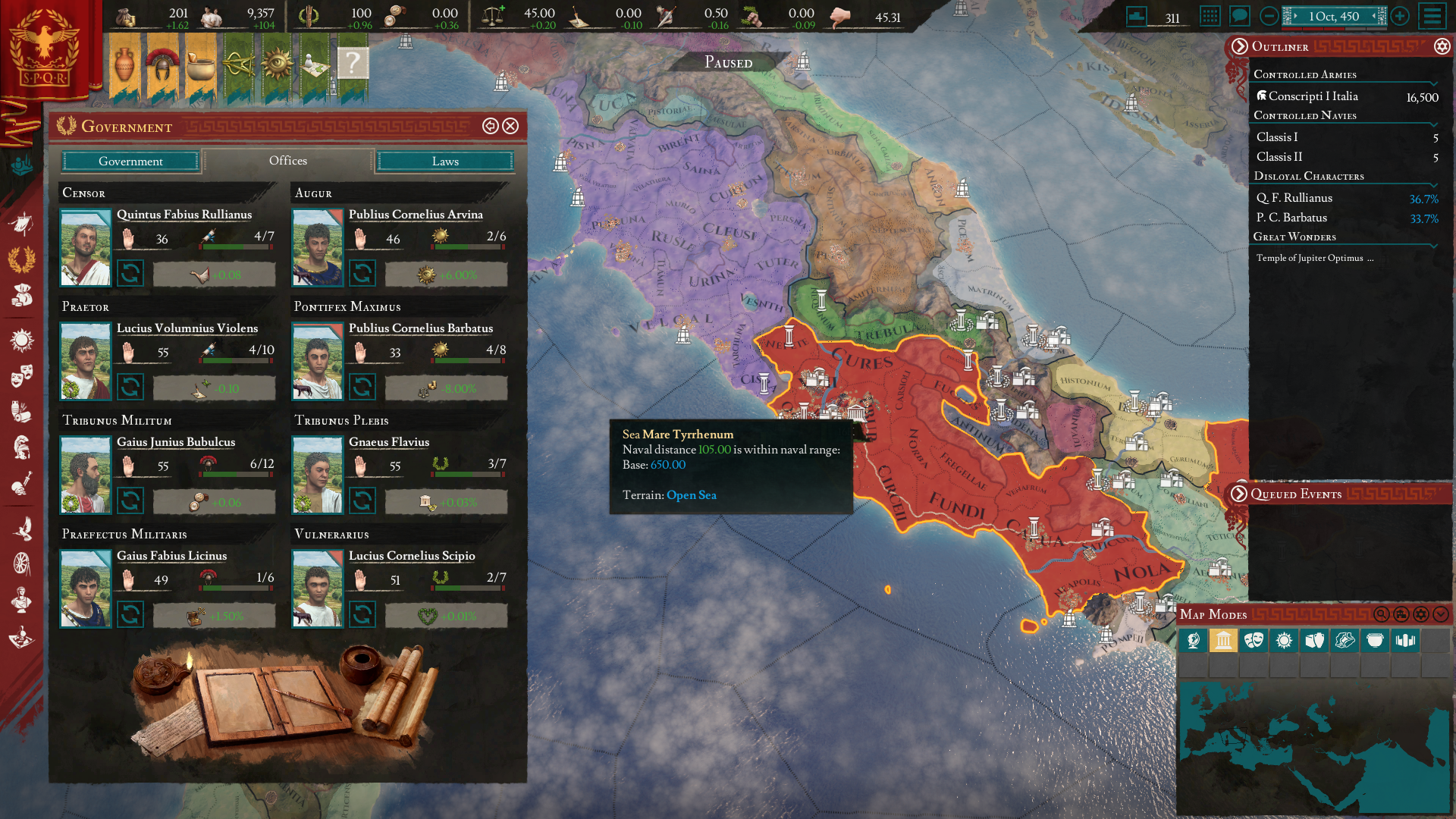
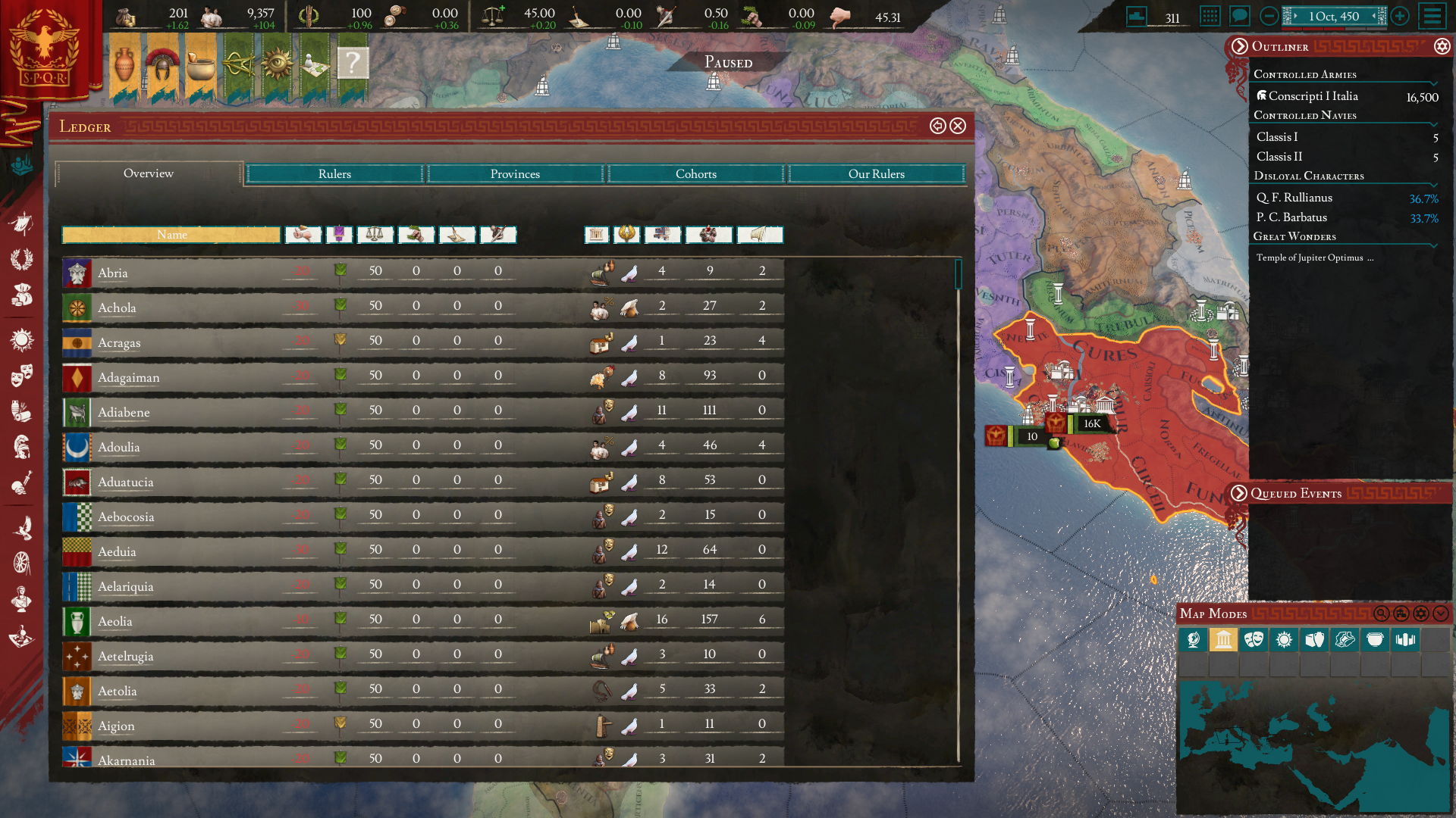
That said, I've not been able to sink more than a few hours in to it at a time... the UI is just too bloody bright for long play sessions, for me.

It appears that the UI uses (mostly) 5 core textures and then a ton of masking maps (which are set to bias/difference/multiply off the underlying texture) to work.

1617756457090.png
1617756927189.png


Here is what it looks like when I inverted the "main" background file. It already looks lightyears better with no more Thermonuclear bright menu elements.
1617756691203.png
1617756732995.png
1617756890779.png
1617757841101.png


However, all of the font colours would need updating too as you can see above, plenty of text becomes unreadable, though you can probably get part-way there just by experimenting with the other files I circled above. (and I've not screwed with interface modding much in Stellaris, so wouldn't even know where to begin here with manipulating fonts, assuming I'd even want to put the effort in for this - which I don't).

Further, given that there are like 4-5 files used to define the "red" parts of the UI... I'm a little confused as to why there isn't a feature that makes it adapt to your flag colour - or even a game menu that lets you set the accent colour to whatever you like. UI customisation hasnt been huge in past PDX games... but this really seems like untapped low-hanging-fruit. Also, Default Red only makes sense for Rome, and a handful of other nations.
1617758415800.png
changing a single file re-paints like 60%+ red UI accents, a further few files cover the rest.

I know there have been all sorts of mechanical changes to the game since 1.0. But the one thing that's always held me back (and I imagine others, too) is the same thing that has yet to truly be changed - the lack of a 100% dark mode.
The new UI is definitely an improvement over the old one (whose grey blocky form, If I'm honest, reminded me too much of a windows 95/98 interface) but the lack of a true dark mode stands out as much as any eye-piercingly-bright UI element does in a game like this, built around long play sessions... I don't want to feel the eyestrain of an excel spreadsheet when I'm playing a game.​

Does anyone know if there are official plans for a Dark UI toggle? Or if anyone is actively working on a Dark UI mod for the new version of the interface?
 
Last edited:
  • 6Love
  • 2
  • 1Like
  • 1
Reactions:
I tried blue light reduction to save my eyes. But then it becomes hard to spot the difference between family colors, so i gave up that approach.
 
  • 1
  • 1Like
Reactions:
Title. I like the new version of Imperator, its not a time period I typically get too excited over, but it's interesting.

That said, I've not been able to sink more than a few hours in to it at a time... the UI is just too bloody bright for long play sessions, for me.

It appears that the UI uses (mostly) 5 core textures and then a ton of masking maps (which are set to bias/difference/multiply off the underlying texture) to work.

View attachment 701490View attachment 701495

Here is what it looks like when I inverted the "main" background file. It already looks lightyears better with no more Thermonuclear bright menu elements.

View attachment 701492View attachment 701493View attachment 701494View attachment 701496

However, all of the font colours would need updating too as you can see above, plenty of text becomes unreadable, though you can probably get part-way there just by experimenting with the other files I circled above. (and I've not screwed with interface modding much in Stellaris, so wouldn't even know where to begin here with manipulating fonts, assuming I'd even want to put the effort in for this - which I don't).

Further, given that there are like 4-5 files used to define the "red" parts of the UI... I'm a little confused as to why there isn't a feature that makes it adapt to your flag colour - or even a game menu that lets you set the accent colour to whatever you like. UI customisation hasnt been huge in past PDX games... but this really seems like untapped low-hanging-fruit. Also, Default Red only makes sense for Rome, and a handful of other nations.
View attachment 701502changing a single file re-paints like 60%+ red UI accents, a further few files cover the rest.

I know there have been all sorts of mechanical changes to the game since 1.0. But the one thing that's always held me back (and I imagine others, too) is the same thing that has yet to truly be changed - the lack of a 100% dark mode.
The new UI is definitely an improvement over the old one (whose grey blocky form, If I'm honest, reminded me too much of a windows 95/98 interface) but the lack of a true dark mode stands out as much as any eye-piercingly-bright UI element does in a game like this, built around long play sessions... I don't want to feel the eyestrain of an excel spreadsheet when I'm playing a game.​

Does anyone know if there are official plans for a Dark UI toggle? Or if anyone is actively working on a Dark UI mod for the new version of the interface?

Nice work!

I am normally a dark mode kind of guy, but for I:R I actually like the brightness.

It doesn't really bother me in the way bright UIs usually does. Could be my monitor settings as well.
 
  • 2
  • 1Like
Reactions:
Could be my monitor settings as well.
I thought about that too, doesnt seem to be the colour balance.
That said, i've sepia-fied most of the interface and it's a lot more bearable without having to mess with font colours
1617795336520.png

1617795263025.png

Ideally I'd want to turn down the opacity on the top bars a bit too, to further kill the glare, but the weird ass way they've coded the UI means that it cant be done via textures directly. Or atleast just messing with the alpha maps doesnt do it. Must be some values in the interface files.
 
  • 5Like
Reactions:
I thought about that too, doesnt seem to be the colour balance.
That said, i've sepia-fied most of the interface and it's a lot more bearable without having to mess with font colours
View attachment 701577
View attachment 701576
Ideally I'd want to turn down the opacity on the top bars a bit too, to further kill the glare, but the weird ass way they've coded the UI means that it cant be done via textures directly. Or atleast just messing with the alpha maps doesnt do it. Must be some values in the interface files.
The purple details on that HUD just further fuels my desire for the UI elements to be coloured based on culture group, or even flag colour.
 
  • 7Like
  • 2
Reactions:
I've posted the Sepia / Purple one to workshop (there are about 40 DDS edits and 1 GUI file edit, to make all the purple trim fit. So probably not achievement compatible).


the red/black background one looks exeptionally good, if the font color could be changed to white and release it as a mod it would be really nice
I've had a look at the GUI files, whilst someone could go through and edit each font in the GUI folder (you'd have to do it for every text box for every gui file - and check the readability for each one), its a lot of work, so I wont be doing it. Others are more than welcome to do so, however.
 
  • 1Like
Reactions:
I’ll never understand the strange obsession some people have with dark UIs...

But hey, good for you that you were able to mod the UI to make it more to your taste.
 
  • 2Like
  • 1Haha
  • 1
Reactions:
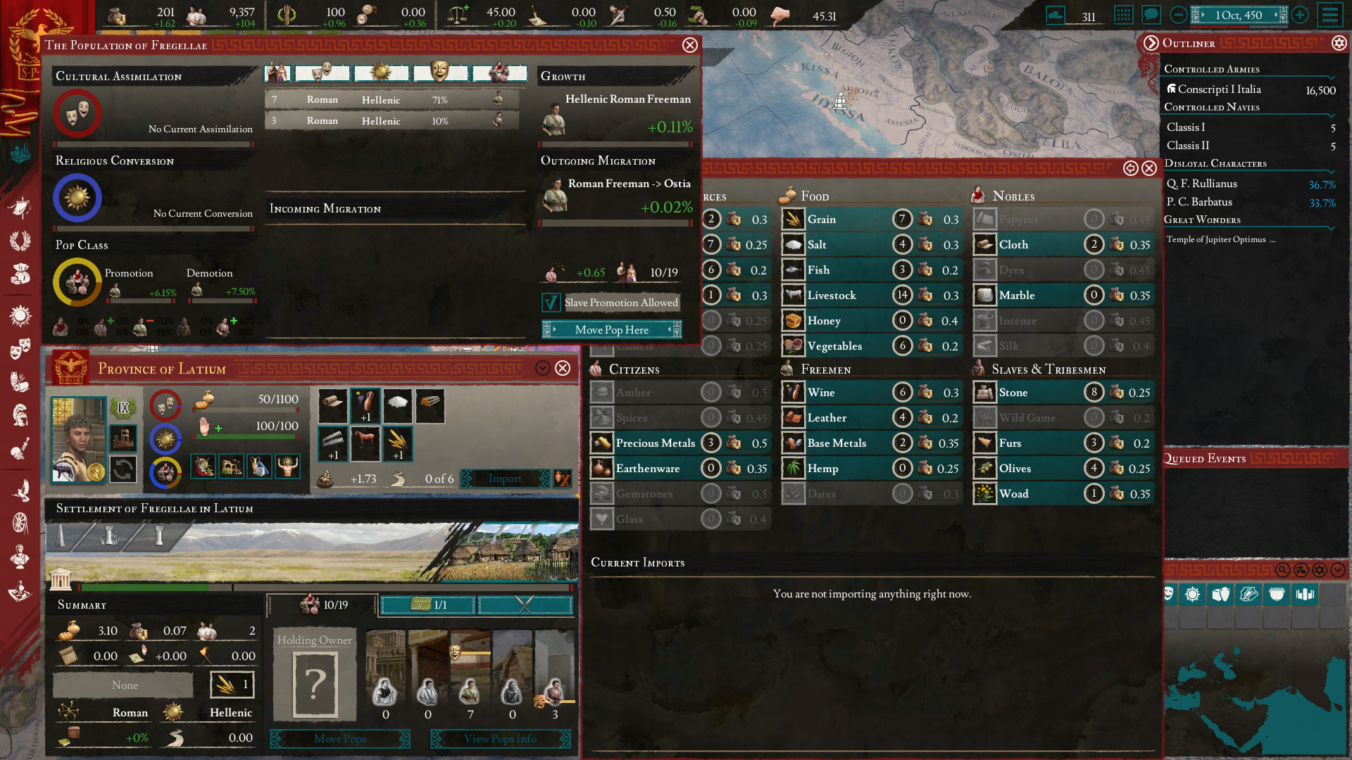
So its been a slow morning and I had some time to take a crack at a dark UI anyway, have converted like 90% of the fonts so far using a few batch commands ( basically "using = Black_FontColor" > "using = White_FontColor #### using = Black_FontColor" and a few instances of replacing colour = { x x x 1} when they didnt use prebuilt font styles)

Some screens look decent (though I probably ought to screw with a few of those other textures - ive only edited 1 for this + the font colours - also curious about "dark + transparent or dark blue rather than black, like the CK3 UI)
1617883117482.png
1617883293599.png

Reds look a bit off on brown, doesnt help that the vanilla font is a bit hard on the eyes (stellaris' font remains the best PDX one so far, I think).

Other screens look a little dodgy still.
1617883380813.png


One option might be to replace most of those parchment colours with something like dark red or maroon, as dark primary colours + white tend to have better contrast, as seen below on the trade screen.
1617883449062.png


Worth noting that, unlike Stellaris, I dont know as much about Imperator, so there may be UI screens I dont know about (though I think i'm covering all of them).
 
  • 4Like
Reactions:
Can you lower the brightness on the screen itself?
You don't understand. The brightness of my screen is not a cause. My problem is a harsh contrast between colours (red, turquoise and white) and I didn't have this problem with previous version of the UI (before 2.0).

I don't need a BLACK UI without fail. I need a dark UI, maybe a grey UI, a gold UI, any UI with a lower contrast and with a possibility to get achievements.
 
  • 1Like
Reactions:
and with a possibility to get achievements.
fairly sure that bit is impossible with how mods seem to work here?

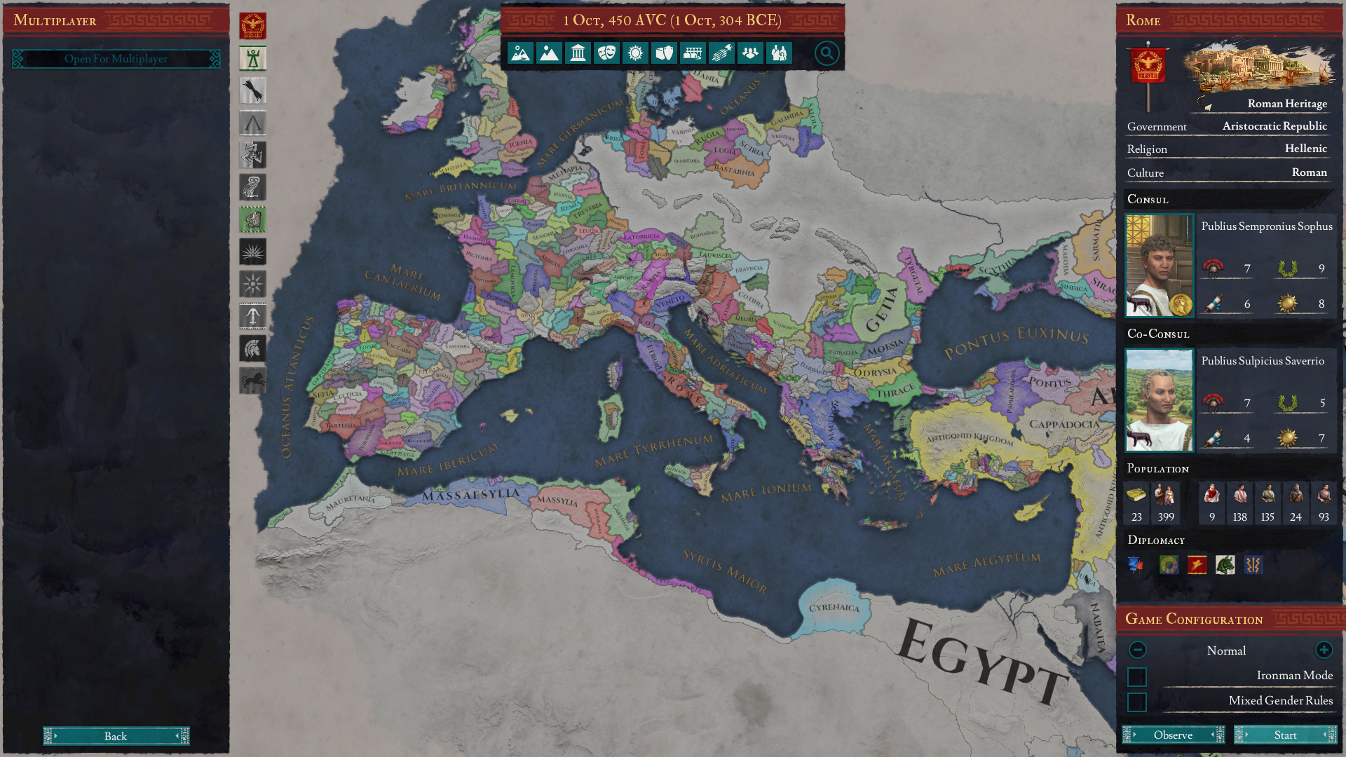
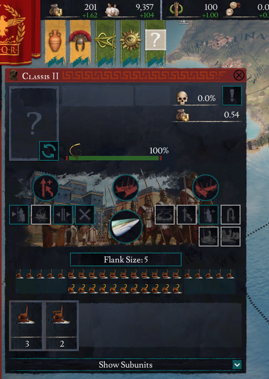
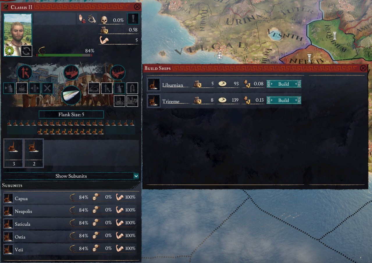
Also, settled on a colder palette, seems to make text easier to read - for me anyway.
1617889041153.png


Some buttons and icons still look a bit dodgy here and there (like the multiplayer button above has a very dark /transparent background - and the fleet/navy screen below), need to see if there is a low-effort way to account for that.
1617889226799.png
1617889308362.png
 
Last edited:
  • 2Love
  • 1Like
Reactions:
Some buttons and icons still look a bit dodgy here and there (like the multiplayer button above has a very dark /transparent background - and the fleet/navy screen below), need to see if there is a low-effort way to account for that.
Is it possible to change the turquoise colour of buttons and frames to red (as headlines)?
 
This variant is similar to CK3. ;)
Lol you're right, maybe I should do a version with CK3 style gold trim, rather than red.

Is it possible to change the turquoise colour of buttons and frames to red (as headlines)?
Possibly. still looking into how buttons work to make some brighter/stand out more. Though red buttons might be confusing if they're set to inactive vs active. Will have a look.
 
fairly sure that bit is impossible with how mods seem to work here?

Also, settled on a colder palette, seems to make text easier to read - for me anyway.
View attachment 701948

Some buttons and icons still look a bit dodgy here and there (like the multiplayer button above has a very dark /transparent background - and the fleet/navy screen below), need to see if there is a low-effort way to account for that.
View attachment 701950View attachment 701951
These pictures look really nice, is it going to be a mod? Will it be compatible with achievements? Will you publish it on paradox platform as well as on steam workshop? Please add link or name if you do.

Thank you.
 
  • 2Like
Reactions:
These pictures look really nice,
Thanks!
is it going to be a mod?
Yes
Will it be compatible with achievements?
Truthfully, I have no clue. I assume it will not be achievement compatible, because any(?) mod disables achievements on Imperator (or atleast thats what the ingame tooltip says?) unlike just those that change checksum on their other games.
If anyone knows otherwise please let me know.
Not sure if changing gui files constitutes a checksum change on IR, either.
Will you publish it on paradox platform as well as on steam workshop?
Sure, I can mirror it there when I am done and post links to both, main description will go on steam, as I truthfully have no clue how the paradox modding site works lol.
 
  • 1Like
  • 1Love
Reactions:
Thanks!

Yes

Truthfully, I have no clue. I assume it will not be achievement compatible, because any(?) mod disables achievements on Imperator (or atleast thats what the ingame tooltip says?) unlike just those that change checksum on their other games.
If anyone knows otherwise please let me know.
Not sure if changing gui files constitutes a checksum change on IR, either.

Sure, I can mirror it there when I am done and post links to both, main description will go on steam, as I truthfully have no clue how the paradox modding site works lol.
I know that the Mod that changes the colour of neutral armies to grey is achievemnt compatible. I got an achievement with it on.
Best way to check would be with the mod on and trying to get an easy achievemnt. If it doesnt work try the same thing without the mod.
 
  • 2
Reactions: