Elements of bad user experience from the previous UI are still present in the new one... Some of the new changes are actually a downgrade.

  • We have updated our Community Code of Conduct. Please read through the new rules for the forum that are an integral part of Paradox Interactive’s User Agreement.
I asked this in another thread, but it has been buried, so I shall ask again here: does anyone know where province modifier icons have gone?
There you are. Check the image of this guy's reply.
According to me the most frustrating downgrades:


View attachment 682437
Minimize province summary. Missclicked that like 100 times. Like 25% of the outer part of the flag (to the left) will minimize it. The "X" to close the view is to small. Who does even minimize it?? You have to click inside the black box else it minimize. Remove that function entirely..


View attachment 682438View attachment 682439
Trade
Can't tell its a trade good is available... I mean last version was pretty good, the only thing what was needed to make it even easier to see at a glance. Like gray it out totally if its not. I suppose its a bug?? The green thing would prob tell if it is, but its still way worse to see at glance. To make it consistent with green -> clickable? Huge downgrade either way. Also sort it like it was before...
And why do i get a notification when a country deny trade request? (from autotrade function. I dont care, keep trying without bugging me)

View attachment 682443
Offices, scored family etc.
Why cant i see the health of a potential Governor or minister? Im not gonna apoint a gov which is about to die and screw up all my policies AGAIN. Why didnt you copy the Better UI mod? You must be aware of it. That one is exactly how it should look like, ALL THE WAY. Now its so hard to see who belong to which family, are they 4/3 etc. I mean i was sure you would copy his design bc its so perfect, but this..?

View attachment 682446

National overview
So much information is missing from both these tabs. It needs to have a full breakdown of stuff here.... It NEEED: Total pop, each poptype, religion and culture (P R I M A R Y), loyalty ( increasing or decreasing) same with food. Would be nice with some extra stuff like tax, manpower or what ever. This one is totally empty. And i cant even see territories btw...

View attachment 682458

Province.
I actually just noticed that the happiness is that bar on the pop. This is so overdone. We just need a number next to the pop. So much wasted space were you instead could merge it with the building tab. The "military" you could instead just stuff with info you dont need so often... In MY opinion, the size of it the window doesnt matter... It CAN be big. 99% of the time the game is paused when you do stuff there. If you click on anything else it closes down anyway, its not like you can multitask and control army at the same time.
And most important, "Territories in province" WHERE IS IT???? Your killing me. Give me A LIST.


Dont get me wrong, there are alot of VERY welcome improvements. But for me, the game was already very good, the UI/UX is the most important thing that i wanted improved, not downgraded... It really frustrate me after some hours. Worst of all i feel it cant even be fixed bc they need to move on to new stuff... I dont know if ill be able to play like this i think.
Can you see a grey bar between Research Output and local Culture? That's the bar where modifiers are put. There you see a Mask there, probably a Modifier adding happiness.
 
In a sense, it's not gone, just changed places.

Look under governorships and provinces--you see all the territories there (perhaps it should just have more info---like trade goods etc).
no, that's a list of provinces within a region. we need a list of territories within a province, ideally that we can navigate to within the province view.
 
  • 3
  • 1Like
Reactions:
In a sense, it's not gone, just changed places.

Look under governorships and provinces--you see all the territories there (perhaps it should just have more info---like trade goods etc).
I guess next time you should redden your "In a sense" with large font size.

The thing about this particular small button was very useful. I am just not sure why there is a decision to kill it from the Provincial View.

It was useful but already bad because we couldn't sort, and couldn't see which of the territories were cities.

And it gets worse now it's totally gone.
 
  • 2Like
  • 2
Reactions:
How do you add the large screenshots?

PS I have to laugh at people disagreeing with critiscism of self-evidently poor design choices, and critiscism of features being removed which are clearly factual!

:)
 
Last edited:
  • 1
  • 1Haha
Reactions:
I'm experiencing issues with the last button shown in the picture. It actually has a clickable portion but it's so small it might as well not be there at all.

1613583078270.png


Does anyone have the same issue?
 
  • 3
  • 1Like
Reactions:
If you have a peace deal open, when you click ESC, instead of closing the screen, it goes the menu, what? why?
 
Last edited:
  • 7
Reactions:
Buildings - agreed. Levies - there aren't many Regions, but it's probably a good idea to use the Levy Mapmode to assign where you want your Levies to be raised. For Diplomacy, just right click their territory.

I didn't knew about that right click function

I started my campaign with the Seleucid empire so maybe that's why I felt overwhelmed about the levies.

I'll check that Levy mapmode later

Thanks
 
  • 1Like
Reactions:
I don't mind the numbers and I found the tab to change a cities status really fast.

My personal 2 issues is how characters that are a part of a major family has a small colored corner. Colors such as green and blue that blend heavily into the background and it makes me feel really bad for the color blind people who play this. That and that trade goods now no longer has the check mark if a nation is willing to trade you in a certain resource. So most of the time I go through the trade menu it's trying to find a trade good that a nation is willing to trade.

The new UI has it's issues. I'll agree with that whole heartedly. But in the end...I will have to say overall it's much better than the old one.
Not just for the colourblind! Depending on the background, those coloured corners can be extremely hard to see or interpret even for people with perfect eyesight!

I do think the overall framework for the new UI feels like a big step forward, but it's absolutely filled with specific details that are kind of maddening. Agree with almost everything that's been pointed out in this thread. Just full of issues which are immediately obvious and immediately make you question "why did anybody think this was a sensible implementation?" or "how did nobody notice this issue?"
 
  • 7
  • 4Like
Reactions:
i find it ironic that one of the things the devs were more proud of was the UI redesign but its one of the things most players have had problems with, its not even a "they changed it so now sucks" its more of borderline ridiculous descicion making

it might actually be worst than before
 
  • 6
  • 6
  • 2Like
Reactions:
one event ,old one is really making me angry , it spawns if you have more then 10 tyranny, options are embrace the reputation for 25 PI or lose 5 stability, how much times one can " embrace" the reputation ? like why , you get a title tyranny you cannot get it on square, whats the point of it, just to have something to click on ?
 
  • 1
Reactions:
i find it ironic that one of the things the devs were more proud of was the UI redesign but its one of the things most players have had problems with, its not even a "they changed it so now sucks" its more of borderline ridiculous descicion making

it might actually be worst than before

As I mentioned before, it is a mixed bag at best. Improvements in some areas, non-sensical and just plain silly downgrades in others.

Making the UI prettier? Absolutely, I am all for it. However, the functional downgrades drive me mad.
 
Last edited:
  • 9
  • 5Like
  • 1
Reactions:
i find it ironic that one of the things the devs were more proud of was the UI redesign but its one of the things most players have had problems with, its not even a "they changed it so now sucks" its more of borderline ridiculous descicion making

it might actually be worst than before
I realy think they should be proud of the new UI. It's absolutly gorgeous!
The problem is its functionality is in some aspects worse than the old UI and in many aspects a lot worse than what it very easily could be.
I welcome the change very much, just please don't stop at the current version.
 
  • 5Like
  • 2
Reactions:
I realy think they should be proud of the new UI. It's absolutly gorgeous!
The problem is its functionality is in some aspects worse than the old UI and in many aspects a lot worse than what it very easily could be.
I welcome the change very much, just please don't stop at the current version.
yeah its pretty but unintuitive and not very useful
 
  • 4
  • 2Like
  • 1
Reactions:
I accidentally got some LI in my legion through an event. Can't we remove units from a legion?? Maybe I'm blind but I couldn't find it for the life of me.
 
yeah its pretty but unintuitive and not very useful
User Interface, first matter should be usability since it's the same word "usable" for a user. Aesthetics should come in second.
 
  • 2
Reactions:
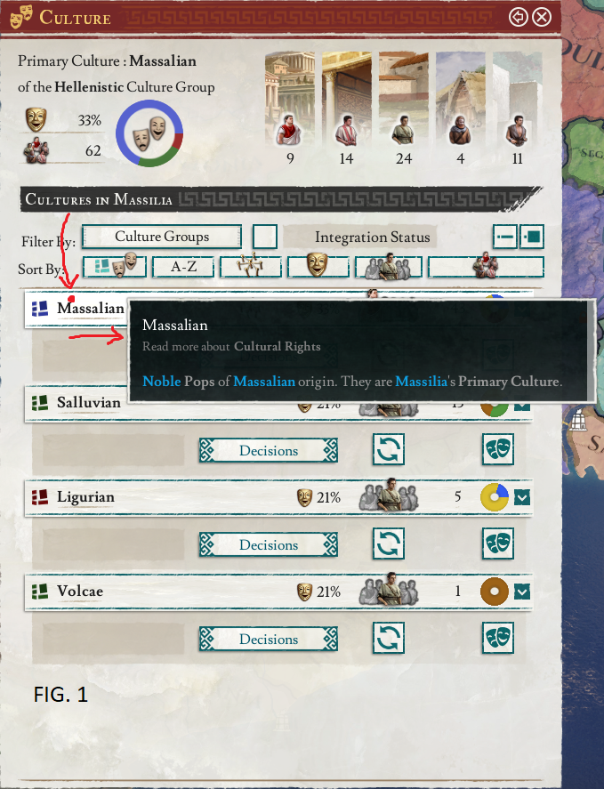
Alright, this one's a bit heavier:


1613599880486.png


1613599908354.png


1613599926801.png


FIG. 1: Moving the cursor from the top until a tooltip appears. After locking the tooltip (both timed lock and action lock tested) moving the cursor to the right to interact with the tooltip leads to FIG. 2 instead of letting me mouse over the (now locked) tooltip.

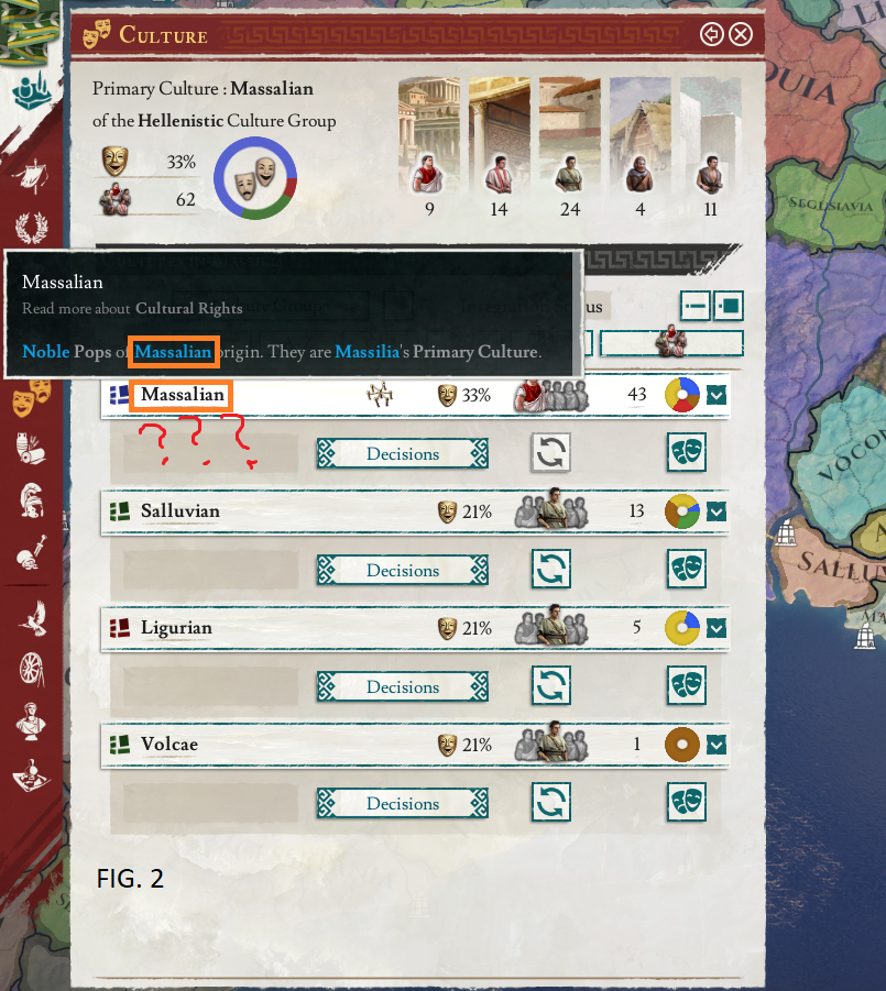
FIG. 2: I am now presented with the same tooltip in a different spot and I have to lock it again. Note that I only attempted to move the cursor towards the locked tooltip in a straight line. Now let's turn our attention towards the tooltip itself. I am trying to get info on the term "Massalian" in this culture tab. I am presented with a tooltip giving me almost no information aside from what was already presented using infographics or otherwise in the tab,

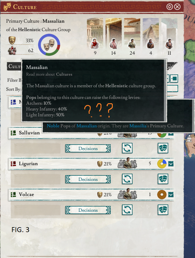
FIG. 3: After pointing at the term (Massalian) inside of the tooltip generated from the very same term (Massalian) I am presented with an interely different tooltip describing the culture and its levy composition.


When two things are the same they should behave the same way. Moreover where else would I go looking for culture info like levy composition than the culture tab of the interface. The process of getting to the desired information is now extremely convoluted and also hindered by the broken tooltip locking.

Don't get me wrong, I love the update and the new UI style. But just... get everything in this thread fixed and the game will be so much better! ;)
 
Last edited:
  • 8Like
  • 6
  • 2
Reactions: