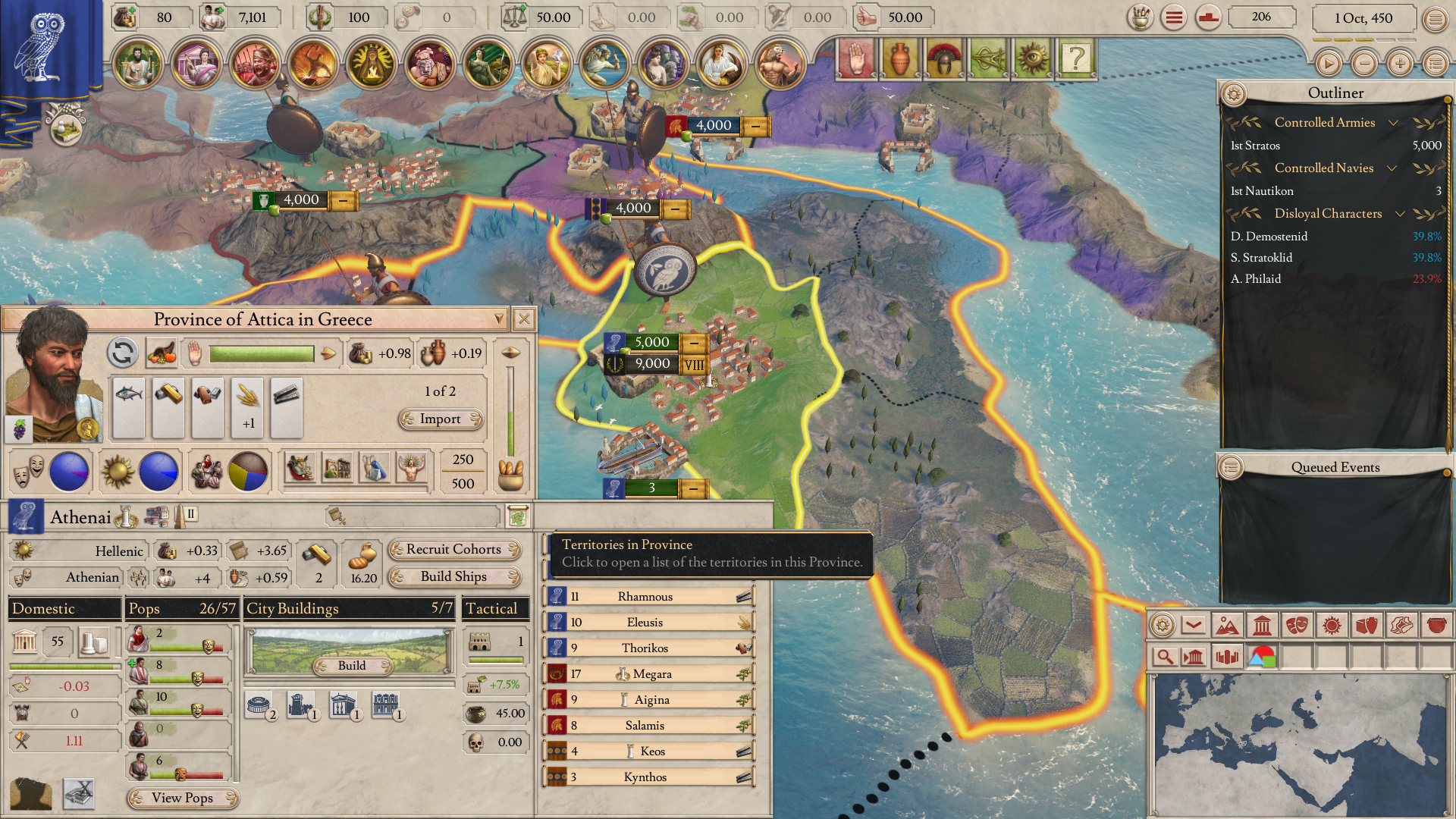
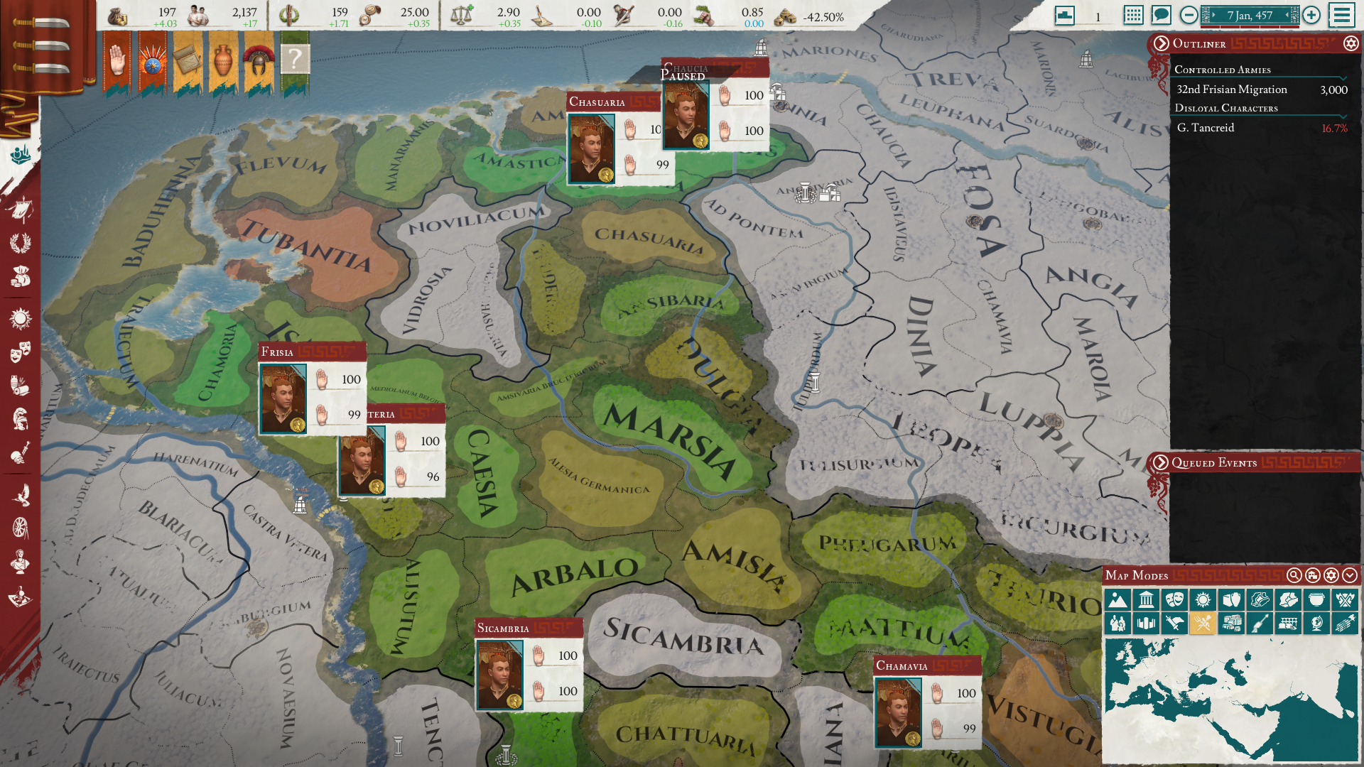
Elements of bad user experience from the previous UI are still present in the new one... Some of the new changes are actually a downgrade.

  • We have updated our Community Code of Conduct. Please read through the new rules for the forum that are an integral part of Paradox Interactive’s User Agreement.
That's an issue with the overarching game design. Why this game isn't character oriented like Crusader Kings in an era where major events are driven by individual actors is hard to understand.

I disagree. They already have a character-focused game in CK3, and even though I'd love nothing more than to see a fleshed-out antiquity mod for CK3, Imperator Rome was supposed to be something different - not just another CK clone. Besides, it's more than possible to have a confusing UI in character-focused games, so that's not the issue here.


The game wants the player to manage an entire realm while removing any and all delegation of duties (you cannot assign governors to rule in your stead, etc. because you play as the "state" and are therefore expected to micromanage every aspect of your nation).

That is a fair complaint and I'm inclined to agree with you but that's pretty much the case with all PDX games. Hopefully, they'll give governors a bit more agency in the future, but giving them the option to control the imports/exports of their own provinces is a step in the right direction.

This game should have gone even deeper than Crusader Kings in regards to roleplaying as a single character. Orienting gameplay to such a degree would allow for more interesting storytelling

No. PDX already has CK3 which empathizes the roleplaying and storytelling aspect. Why have two separate teams develop two similar games? It would have been a lot easier, and more reasonable, for them to just make an antiquity DLC for CK3 than to make a brand new game. Would have saved them some money as well I assume. Besides, how could they have gone deeper into roleplaying than CK3? Again, it just sounds like you want Crusader Kings: Rome.
 
  • 11
  • 2
Reactions:
If someone can add as I don't have access to the game right now:
in a province, looking at the population details (after clicking the "view pops info" button.
Howering the piechart for religion or culture gives the nation break down (or so it seems). Maybe even just the pop split (nobleman, citizen...)
Nothing useful considering the context.
Note: this was in French, not sure it's the same in English but should be
 
I disagree. They already have a character-focused game in CK3, and even though I'd love nothing more than to see a fleshed-out antiquity mod for CK3, Imperator Rome was supposed to be something different - not just another CK clone. Besides, it's more than possible to have a confusing UI in character-focused games, so that's not the issue here.


That is a fair complaint and I'm inclined to agree with you but that's pretty much the case with all PDX games. Hopefully, they'll give governors a bit more agency in the future, but giving them the option to control the imports/exports of their own provinces is a step in the right direction.


No. PDX already has CK3 which empathizes the roleplaying and storytelling aspect. Why have two separate teams develop two similar games? It would have been a lot easier, and more reasonable, for them to just make an antiquity DLC for CK3 than to make a brand new game. Would have saved them some money as well I assume. Besides, how could they have gone deeper into roleplaying than CK3? Again, it just sounds like you want Crusader Kings: Rome.
Kinda off-topic, and obviously IR is what it is (and I think that's fine actually) but what would have been a really interesting approach to the area would have been a sort of "bureaucratic CK". So instead of CK where everything is ultimately based on the feudal model and your specific territorial holdings, you could just be a general, an administrator etc. and build a power base from that.

I'd love to see such an approach to the period that builds an actual system towards that rather than have the various "hacks" in CK to make the feudal base system work with stuff like Republics or the Byzantine administration.
 
  • 5Like
  • 1
Reactions:
I disagree. They already have a character-focused game in CK3, and even though I'd love nothing more than to see a fleshed-out antiquity mod for CK3, Imperator Rome was supposed to be something different - not just another CK clone. Besides, it's more than possible to have a confusing UI in character-focused games, so that's not the issue here.

You know, it's been interesting to watch this discourse develop over the years. Like, in the beginning Paradox made historical strategy games. They picked a period and then they built a system to- there's a particular sort of person who gets spectacularly annoying if you breathe the word "simulate" near a discussion of game design, so let's go with "produce an experience appropriate to"- that period.

So you've got EU, which as the first born ends up being kind of generic, but ended up with quite involved mechanics for colonisation and trade and religious strife, because those are all big factors in the history of the period. Vicky has a strong focus on demographic transformations and economic development, because it covers the industrial and political revolutions of the long 19th century. HOI is all about the state as a machine for making war. Crusader Kings is set in a period and region in which personal relationships between elites is perceived to have been anomalously central to state processes.

But at some point, I think somewhere between the releases of CK2 and Stellaris, the perception of this has shifted from "Paradox makes games about historical periods, with systems tailored to them" to "Paradox makes games with different systems, that are set in historical periods". So Crusader Kings isn't the "mediaeval" game, it's the "character-focused" game, and thus no other game in the stable can have character mechanics, because that would be stepping on CK's toes (??). And any discussion of whether or not those character mechanics would be appropriate for a representation of the classical period is somehow irrelevant (???).

Well, anyway.
 
  • 13Like
  • 7
  • 2
Reactions:
I' going to place my QoL-Suggestion here: https://forum.paradoxplaza.com/foru...ks-for-huge-qol-selecting-characters.1457024/

The Problem is that not only uses the Select Commander window a slightly different layout than selecting a governor or an office-holder, but none of these windows can be sorted, meaning you have to go through most options to find the character you want, every time a new job needs to be filled.
 
  • 2Like
Reactions:
And where is this button in 2.0?

1613573647798.png


It was very useful for going through your owned land.
 
  • 14Like
  • 5
Reactions:
I've been very disheartened with 2.0 so far, everything is actually more confusing.

Before I could easily see the pops happiness and I could just click on the building I need, now I need to switch tabs.

Recruiting levies, I don't know the name of every province so it frustrates me not knowing where my armies are going to appear.

When I click on a nation, there is no longer a button to direct me to diplomacy.

I need to play more but I'm not liking 2.0 so far.
 
  • 6Like
  • 3
  • 3
Reactions:
I've been very disheartened with 2.0 so far, everything is actually more confusing.

Before I could easily see the pops happiness and I could just click on the building I need, now I need to switch tabs.

Recruiting levies, I don't know the name of every province so it frustrates me not knowing where my armies are going to appear.

When I click on a nation, there is no longer a button to direct me to diplomacy.

I need to play more but I'm not liking 2.0 so far.
Buildings - agreed. Levies - there aren't many Regions, but it's probably a good idea to use the Levy Mapmode to assign where you want your Levies to be raised. For Diplomacy, just right click their territory.
 
  • 2
Reactions:
And where is this button in 2.0?

View attachment 682411

It was very useful for going through your owned land.
This... I cant find any way to look at the terrirories in a province in a list and be able to click my way to that territory from that list... Like it would bother me alot if it was only in the "National overview" tab, but its not even there? I'm a bit frustrated tbh.
 
  • 1Like
Reactions:
This... I cant find any way to look at the terrirories in a province in a list and be able to click my way to that territory from that list... Like it would bother me alot if it was only in the "National overview" tab, but its not even there? I'm a bit frustrated tbh.

Aye, not only are a lot of UI elements worse than what we had before, some features are just removed for no good reason at all.

All of these things need to be looked at ASAP. We waited months for this.
 
  • 5Like
Reactions:
Is there a way to make the tooltips slightly below the cursor? Horizontal scrolling has become really difficult when tooltips block the next icon (in the previous game, it was slightly indented---like 1 mm)
 
According to me the most frustrating downgrades:


Minimize.jpg
Minimize province summary. Missclicked that like 100 times. Like 25% of the outer part of the flag (to the left) will minimize it. The "X" to close the view is to small. Who does even minimize it?? You have to click inside the black box else it minimize. Remove that function entirely..


Trade 1.jpgTrade 2.jpg
Trade
Can't tell its a trade good is available... I mean last version was pretty good, the only thing what was needed to make it even easier to see at a glance. Like gray it out totally if its not. I suppose its a bug?? The green thing would prob tell if it is, but its still way worse to see at glance. To make it consistent with green -> clickable? Huge downgrade either way. Also sort it like it was before...
And why do i get a notification when a country deny trade request? (from autotrade function. I dont care, keep trying without bugging me)

Office.jpg
Offices, scored family etc.
Why cant i see the health of a potential Governor or minister? Im not gonna apoint a gov which is about to die and screw up all my policies AGAIN. Why didnt you copy the Better UI mod? You must be aware of it. That one is exactly how it should look like, ALL THE WAY. Now its so hard to see who belong to which family, are they 4/3 etc. I mean i was sure you would copy his design bc its so perfect, but this..?

Overview.jpg

National overview
So much information is missing from both these tabs. It needs to have a full breakdown of stuff here.... It NEEED: Total pop, each poptype, religion and culture (P R I M A R Y), loyalty ( increasing or decreasing) same with food. Would be nice with some extra stuff like tax, manpower or what ever. This one is totally empty. And i cant even see territories btw...

Province.jpg

Province.
I actually just noticed that the happiness is that bar on the pop. This is so overdone. We just need a number next to the pop. So much wasted space were you instead could merge it with the building tab. The "military" you could instead just stuff with info you dont need so often... In MY opinion, the size of it the window doesnt matter... It CAN be big. 99% of the time the game is paused when you do stuff there. If you click on anything else it closes down anyway, its not like you can multitask and control army at the same time.
And most important, "Territories in province" WHERE IS IT???? Your killing me. Give me A LIST.


Dont get me wrong, there are alot of VERY welcome improvements. But for me, the game was already very good, the UI/UX is the most important thing that i wanted improved, not downgraded... It really frustrate me after some hours. Worst of all i feel it cant even be fixed bc they need to move on to new stuff... I dont know if ill be able to play like this i think.
 
  • 5
  • 4Like
  • 1
  • 1
Reactions:
In the new provincial map mode you can no longer see at a glance which provinces are currently loosing or gaining loyalty. This was indicated with arrows in 1.5.

2021_02_17_1.png


The unrest map mode is even worse, because in addition to lacking this information it displays the loyalty of the governors and the loyalty of the province with the same symbol on top of each other.

2021_02_17_2.png
 
  • 15
  • 6Like
  • 4
  • 1Haha
Reactions:
It's gone, one of the mst useful features of the entire UI has gone. When you get away from the imp[roved visuals, it's hardly any better than the old one.

In a sense, it's not gone, just changed places.

Look under governorships and provinces--you see all the territories there (perhaps it should just have more info---like trade goods etc).
 
  • 1
Reactions:
In a sense, it's not gone, just changed places.

Look under governorships and provinces--you see all the territories there (perhaps it should just have more info---like trade goods etc).
Not really, u dont see any territories there, just the name of the province. And u cant click through them anyway even if it was there. It would jump to that territory and you would have to open that tab again to get back to the list. Its not even there so doesnt matter anyway.
 
In a sense, it's not gone, just changed places.

Look under governorships and provinces--you see all the territories there (perhaps it should just have more info---like trade goods etc).


It gives you geographical info about your own territories/cities, which is useful and nothing else. The rest of the province doesn't exist apparently There's no list of T/C's. and who owns them with a little flag with a button that would direct you to that nation.

It's as bare-bones as it gets.. Yet 60% of the panel is blank space, it boggles the mind...all this was better done last time up.

This UI is clearly the result of a rushed lauch, inadequate resources given to development, and a total unwillingness to allow the commnunity who have paid over and over for this ongoing debacle of a game, to open beta test 2.0, because I gaurantee it would be light years better than it is now.

A streamer also just pointed out, you still can't search your nation by "marriage"....

:rolleyes:
 
  • 2
  • 1
Reactions: