Imperator DD #106 - UI rework part 2

  • We have updated our Community Code of Conduct. Please read through the new rules for the forum that are an integral part of Paradox Interactive’s User Agreement.
Something I also just noticed: In the DD #102 the nation overview showed the government type (like aristocratic monarchy). Will this still be somewhere easily visible in the new UI? Because it's currently gone in this DD.

Maybe extent the nation overview a bit to the bottom and integrate again this black bar between the pie charts and the national ideas, which was in the DD #102 and showed the government type. This separation made the nation overview also better structured, just because of this small addition of a bar.
 
Last edited:
  • 1
Reactions:
I already feel the rage building inside Lambert due to Pie Charts still being a thing ;)
tenor.gif

NO!
giphy.gif
 
  • 21Haha
Reactions:
Lots of good stuff coming to the game looking forward to it, cant wait for the macro builder changes it will make managing your Empire so much better, building was one of the most tedious things in the game.
 
  • 4Like
Reactions:
View attachment 648821

Having a different temple graphic for each of them is so important. This could be done by having 4 standard temple designs, one for each of the catagories, then adding more based on culture and some unique ones like we have there for Alexander.
Agreed, aside from having painted statues* as telling difference, having different backgrounds goes along way in telling the temples apart which helps to add with immersion but more importantly it is an easy quick way to go "okay so Isis is the fertility deity and Amun is the culture deity." plus for some culture or tag specific deities, ie the various Hellenic epithet specific deities, different backgrounds can go let you instantly know okay "Athena Parthenos is the Athenian specific epithet of Athena while Athena Polioukhos is the spartan specific epithet of Athena."

Yes you can read text but a picture is well something you will notice before the text.

*and Yes, I do think Painted statues will work well here as you can go "okay that statue is Apollon" or "that statue is of the Goddess Athena". I want my painted statues. :p
 
  • 7
Reactions:
The basic premise is that pie charts are poor at communicating data. They take up more space and are harder to read than the alternatives. The brain's not very good at comparing the size of angles and because there's no scale, reading accurate values is difficult.

And they look bad.
 
  • 8
  • 6
  • 2Like
  • 1
Reactions:
Something I also just noticed: In the DD #102 the nation overview showed the government type (like aristocratic monarchy). Will this still be somewhere easily visible in the new UI? Because it's currently gone in this DD.

I agree it worked well as a divider. We're absolutely going to add the government type back in, as well as some general cleanup in the top section of the Nation overview.
 
  • 14Like
  • 2
  • 1
Reactions:
The basic premise is that pie charts are poor at communicating data. They take up more space and are harder to read than the alternatives. The brain's not very good at comparing the size of angles and because there's no scale, reading accurate values is difficult.

And they look bad.

Agree that they are not useful, but they are beautiful.

@jiroro Could we ask the tooltip wizards to show the raw numbers in a table format? like this:

1604338279916.png
 
  • 11
  • 5Like
Reactions:
The basic premise is that pie charts are poor at communicating data. They take up more space and are harder to read than the alternatives. The brain's not very good at comparing the size of angles and because there's no scale, reading accurate values is difficult.

And they look bad.

As someone who teaches Data Science, I will say that pie charts are not categorically bad. I agree they are often misused, but the linked article misses the point of pie charts.

Pie charts are for comparing the size of a slice to the whole. They are not for comparing the sizes of slices to each other.

Pie charts make it easy to estimate how big a slice is relative to the whole, but make it difficult to compare slices to each other. Bar charts make it easy to compare bars to each other, but hard to compare the bar to the sum of the rest of the bars. This difference means its often helpful to have both.

In Imperator's case for the culture pie chart, the question is whether its important to know the sizes of the cultures relative to each other, or whether its important to know the size of the majority (or plurality) relative to the whole.

You could make an argument for either. If I had to pick one, I'd lean towards pie charts as I'm more interested in the size of the majority/plurality relative to the whole.
 
  • 23
  • 9Like
  • 6
  • 1Love
Reactions:
I agree it worked well as a divider. We're absolutely going to add the government type back in, as well as some general cleanup in the top section of the Nation overview.

Great! :) And thanks for your responses in this thread. It's a pleasure, that the community feedback is taken so seriously!

Edit to adress pie charts:
I guess we can keep the pie charts, but the only number we need to make decisions in terms of culture and religion is the one of the primary culture and state relgion. So maybe these two (percentage) numbers can somehow be integrated in the several tabs below or somewhere around the pie charts, without messing the tabs up in clarity and presentation of other informations.
 
Last edited:
  • 8
  • 1Like
Reactions:
Great! :) And thanks for your responses in this thread. It's a pleasure, that the community feedback is taken so seriously!

Edit to adress pie charts:
I guess we can keep the pie charts, but the only number we need to make decisions in terms of culture and religion is the one of the primary culture and state relgion. So maybe these two (percentage) numbers can somehow be integrated in the several tabs below or somewhere around the pie charts, without messing the tabs up in clarity and presentation of other informations.
Primary or Integrated? I'd like the option personally.
 
  • 1
  • 1
Reactions:
I am loving what the UI looks like, but I have 2 major gripes still.

View attachment 648805
This is a bad way of showing this information. Pie charts, especially these hollow ones, are simply not good enough.
We're playing as the Antigonid Kingdom in this image, so how much of that pie is Macedonian? It looks to be *around* 15-20% right? Well.. no, because the Antigonid Kingdom has more Hellenic cultured pops than just Macedonians... so how much is it? And *around* is not good enough even if every Hellenic culture pop in your nation was Macedonian.

Somewhere in this UI, we *need* a number. Not a pie or other chart, a number, that tells us what the % of our nation follows our primary Culture. Same for religion.

Similarly, for this UI here;
View attachment 648806

I assume the culture and religion breakdown is in the Provinces tab instead? In that case, same story, % of pops that follow primary (or integrated) culture, and % of pops that follow your state religion are imo a necessity.

Other than that, lovely job, I love the aesthetic :)

While cannot share Lamberts irrational dislike of pie, I agree the actual % of Primary Culture Primary Religion should be listed as text directly in front of the Culture listed. "21% Macedonian," "38% Hellenic" fixes the problem with 4 characters and does not clutter things. What your culture is does not typically change over the course of the game, yet the text "Macedonian" takes up real estate there permanently. What percent of your pops are your culture does change, so its the primary information I want to see at a glance.


While I most want numbers, that is in addition not to replace the graphic. I think the pie charts could also be improved by further subdivision. My suggestion is to change the transparency of the pie slice for each subculture if it is accepted or not. I don't need a separate color for each variation of Greekiness. But, If I have Macedonian accepted I want it to be 100% blue, if I have Athenians granted citizenship status they stay at 80%, and everyone else is stuck at 20%. This would also let me see accepted colors in different groups more prominently. The Seleucids would see lots of dark brown for all those integrated Babylonians and Dark blue for their primary Macedonians, but all other cultures would be relatively faded. It seems like things would work nicely if it was simply 20% opacity for each accepted pop type, adding up to 100% if you accept all 5.

You can also apply this to the Religion Chart based on which omens you have active. All pantheons start at a default 20% opacity, and increase by 20% for each deity active. If I have 4 Hellenic deities then Blue is dark blue, and everything else fades off. If I have 1 Cybilene deity in my pantheon, the green gets boosted up to 40% and Hellenic drops to 80%.
 
  • 3
  • 2Like
  • 1
Reactions:
While I most want numbers, that is in addition not to replace the graphic. I think the pie charts could also be improved by further subdivision. My suggestion is to change the transparency of the pie slice for each subculture if it is accepted or not. I don't need a separate color for each variation of Greekiness. But, If I have Macedonian accepted I want it to be 100% blue, if I have Athenians granted citizenship status they stay at 80%, and everyone else is stuck at 20%. This would also let me see accepted colors in different groups more prominently. The Seleucids would see lots of dark brown for all those integrated Babylonians and Dark blue for their primary Macedonians, but all other cultures would be relatively faded. It seems like things would work nicely if it was simply 20% opacity for each accepted pop type, adding up to 100% if you accept all 5.


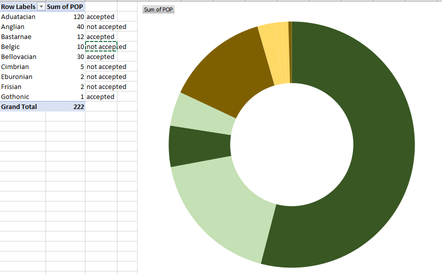
Like this? Not very clear I am afraid. @Radamanthus was right on the main purpose of the pie chart, we cannot extract more than comparing the size of a slice to the whole

1604341766110.png
 
  • 1
  • 1
Reactions:
Can we have macro slave mover? Moving slaves is key however it is very bad in the current state, we have to check territory per territory in the map. I suggest a big window with all the regions, then we click in the region and see all the provinces ( and trade goods within province), and then we click in the province and see all the territories showing the trade good & amount of slaves needed for surplus/pop capacity/slaves number, and we can sort it out. And we have the move slaves button in each territory.
 
  • 12
  • 2Love
  • 1Like
Reactions:
The other alternative is to add a second circle on the outside to show the percentage of primary/integrated cultures. (but I'm not keen on that, tbh)
Because the issue isn't the pie charts per se but the fact that they are missing this important information.

There should be an overview of all cultures, for sure, that's useful. But it's not really that important since cultures don't have unique modifiers (unlike species in Stellaris)
 
  • 3
Reactions:
We haven't seen the UX for Culture. I remember last DD it was blurred, so they are working on that.

I think the more detailed information on cultures and cultures groups must be displayed there.
 
  • 1Like
  • 1
Reactions:
We haven't seen the UX for Culture. I remember last DD it was blurred, so they are working on that.

I think the more detailed information on cultures and cultures groups must be displayed there.
The issue with that is we would want the information in the places where we make decisions, like in the Province view. If they can nail a good version there, it may as well be ported around the other menus too.
 
  • 3
Reactions:
Like this? Not very clear I am afraid. @Radamanthus was right on the main purpose of the pie chart, we cannot extract more than comparing the size of a slice to the whole

View attachment 648882

ish. I am not sure that is a great test on a white background in excel. You can tell a difference between transparency and just a different color when it is on top of the marble texture because you will be able to see the marbling through the chart. but on pure white it just becomes different colors. It may not be enough however when its a pie ring, But still I guess I can largely see even here at a glance that you have lots of green and brown accepted pops, which is what I want to know.
 
  • 1
Reactions: