
Mexbuild's Worldmap - Info & Updates
- Thread starter Mexbuild
- Start date

-
We have updated our Community Code of Conduct. Please read through the new rules for the forum that are an integral part of Paradox Interactive’s User Agreement.
You are using an out of date browser. It may not display this or other websites correctly.
You should upgrade or use an alternative browser.
You should upgrade or use an alternative browser.

Your work is great but i think that Italy needs to have more regions.
I suppose you looked to an original regional map of my country like that http://www.travel-italyonline.com/images/travel-italy.gif .
In my opinion ,to make a very good work, you have to get a look to a province map (for example this http://www.pickatrail.com/jupiter/location/europe/italy/map/ferrara.gif ) but simplifing it because in this case they are too much.
If the final result is a thing like that http://img87.imageshack.us/img87/5370/cartinadiprova.jpg ,you will make me a very happy guy.
Sorry for my bad english and thanks for reading.
Your work is great but i think that Italy needs to have regions.
I am sorry, but doesn't anybody read Mex' posts? At first, he will make a map identical with the original one and with just optical changes, and then he will make an enhanced map with more provinces etc.
You will get your enhanced Italy, but not now.
")
Since a lot can be done aestethically with a 2D map like you're designing I have a few suggestions that were inspired by Silent Hunter IV:

For the large names in the background of the map (such as Pacific Ocean, North Sea, etc.) a beautiful font to use would be Iskoola Pota. It's the font as seen in the image of SH4 above. I think it really brings out that map feel, more than the font than that typewriterish font in vanilla. Looks great in all caps and in italics (cursive).
Second, adding water depth to the map. Vanilla has that hatching thing going on near coastal lines but what would look even better would be something like what's going on near the Bering Sea in the picture above. Different shades of blue that indicate depth. It wouldn't be functional but I think together with that terrain background you showed earlier would look really good and very much like a real map.
Adding water deepness and another font will be easy. Nice ideas.
PS: Iskoola Pota is not a latain font, it look like an Indian font.
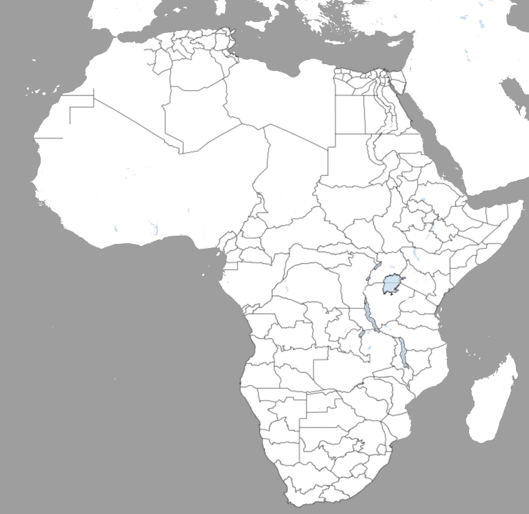
PPS: New status of Africa:
PS: Iskoola Pota is not a latain font, it look like an Indian font.
PPS: New status of Africa:

Last edited:
Apparently it is. Strangely it also isn't:
http://images.google.com/imgres?img...=en&sa=N&tbs=isch:1&ei=T-inS8H7CcHt-AaOtN2WDA
On my computer it's like that.
http://images.google.com/imgres?img...=en&sa=N&tbs=isch:1&ei=T-inS8H7CcHt-AaOtN2WDA
On my computer it's like that.
I won't buy any fonts etc. for a mod.
Naturally. If you don't have it included in your Windows edition I'll take a look and see if I can find a free analog. Shouldn't be so hard. A lot of fonts look sort of like it.

Lesotho looks pretty good. The others look to much like Victoria. Too 19th century than WW2/epic.
what's wrong with the original one, trixieplain? It has a good ww2 feel imho.
+1
What's wrong with the original one, Trixieplain? It has a good WW2 feel IMHO.
after years of playing hoi2 and now aod, trixieplain is ugly as hell...