• We have updated our Community Code of Conduct. Please read through the new rules for the forum that are an integral part of Paradox Interactive’s User Agreement.
ADukes said:
I'm counting 24. :rofl:

No I mean the way the stars are arranged...Not how many stars literally... :mad:

Let's compare the two versions:

The WWII-era flag:

380px-US_flag_48_stars.svg.png


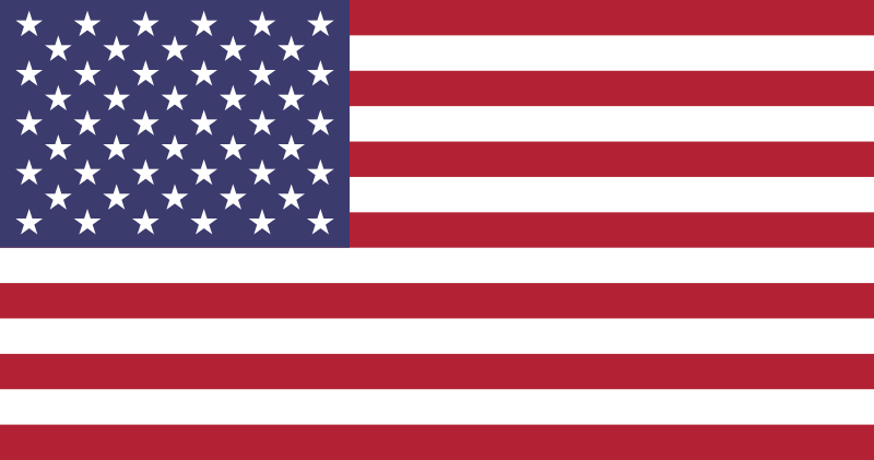
The modern-era flag:

800px-Flag_of_the_United_States.svg.png


So the stars on the sample look kind of crisscrossed just like the modern-era flag, but they should be arranged in a pattern just like the old one because the United States had not adopted the current one and used the 48-star version during WWII, which is the game period right?

By the way, you actually went count how many stars? That really freaks me out! :wacko:
 
Guys, you're aware that there is simply no room for the correct number of stars, right? ;)

Unless I make the thing much bigger, which looks dumb. Sure it's a compromise, you can't expect the same level of detail in such a small area....I could maybe change the pattern a bit...though I doubt it would generally look much better.
 
Last edited:
OK, I need some feedback

Here's another example:


It has a changed flag, but honestly, I think overall the previous version looks better. With the changed pattern now I can use even less "stars" so it looks a bit "empty". These stars and the space in between are one pixel each, so that's the limit we can't overcome to get more stars in with this form of pattern. The previous pattern allowed to fit some more stars into about the same space.

Beside this, what do you think of the pic itself? It's a bit usual compared to the normal ship icons, should I keep it or not?
 
BeBro said:
Here's another example:


It has a changed flag, but honestly, I think overall the previous version looks better. With the changed pattern now I can use even less "stars" so it looks a bit "empty". These stars and the space in between are one pixel each, so that's the limit we can't overcome to get more stars in with this form of pattern. The previous pattern allowed to fit some more stars into about the same space.

Beside this, what do you think of the pic itself? It's a bit usual compared to the normal ship icons, should I keep it or not?

I agree. :D
 
BeBro said:
Here's another example:


It has a changed flag, but honestly, I think overall the previous version looks better. With the changed pattern now I can use even less "stars" so it looks a bit "empty". These stars and the space in between are one pixel each, so that's the limit we can't overcome to get more stars in with this form of pattern. The previous pattern allowed to fit some more stars into about the same space.

Beside this, what do you think of the pic itself? It's a bit usual compared to the normal ship icons, should I keep it or not?
IMHO, it's a little off compared to the others.
 
Regarding the examples you provided, they are very good. And I eargerly await the finished US navy pack.

The last one is terrific, this is of course just a personall opinion but I always liked the Skiff icons wich had a more "belicose like posture". So I say keep that ship firing because it captures a notion of might and power, embodied by the BB of WW2.

Now, about Skiff last pack. I only posted now because there were so many new details to see, so many changes. There were season versions of the same icon, different poses and backgrounds. The final result was almost impossible for me to describe in english!! It was Great in scale and detail. Thank you all.

I´ll just give a few examples of some of my favorite icons.

Ger mountain III and especially the rifled version of IV

ALL SU special forces, look at the marines and paratroopers wow!!

UK late model paratroopers red devils

ALL polish forces!!

Nat and red Spain !! ALL great except tank IV and mountain IV.

ALL US army icons are great.

The new HQ IV for germany the Summer HQ III, the armoured cav nows has a uniformed crewman present.

I could go on and on. THANK YOU !! ;)

P.S. tomorrow i´ll edit my post and place the icons I mentioned just for everyone to remmeber them and maybe discover some previously unseen little detail. Skiff packs are great in that there is always another Great looking icon that makes you go and research that extra tech just to have it.

At least to me that´s the only "negative" side effect of having these great looking icons to play . :rolleyes: Is it just me?
 
Yes those icons are really great !

I hope you can add some addiional to be used with some mods such as mod 34.

Basically some more armour types/ more modern but still non-jet CAS, fighters etc would be great to have...
 
BTW, what's the flag used on the Japanese HQ divisions? Never seen it before.
 
KanaX said:
BTW, what's the flag used on the Japanese HQ divisions? Never seen it before.

Ouch, it shouldn'tbe there :D I use battle flags on HQ just for myself. Forgot to change it back to a standard icon for download. Anyway, it's IJA general staff flag IIRC.
 
Last edited:
you know, you could make two sets, 1 with the "forbidden ensign" and one set with what you have done, and make them seperate downloads, 1 for places that it is allowed and 1 for others which it is not.
 
kristoff said:
*drools* gimme!

@Kristoff, they're not really a problem, I was just wondering. Finnish HQ divs have the Finnish war-flag also, and it look very nice.
 
Hawk_345 said:
you know, you could make two sets, 1 with the "forbidden ensign" and one set with what you have done, and make them seperate downloads, 1 for places that it is allowed and 1 for others which it is not.

Yea, we'll probably have to do this. Kind of irritating...
 
Lafayette53 said:
I would like to see New U.S. Mech Icons at some point (or at least improved) the First one is kind of ugly in my book, but great work anyway!

zajawkatu0.png


No U.S. Navy ?:( Of course German Navy is good too ;) :D

BeBro is working on USN. Look a few posts above.