• We have updated our Community Code of Conduct. Please read through the new rules for the forum that are an integral part of Paradox Interactive’s User Agreement.
Evans said:
I was thinking, maybe the syndicalist red/black could be integrated into that flag somehow? ATM it's plain red.. maybe if the diagonal anarchist flag was used, with the diagonal emerging from the corner of the union jack and the emblem imposed in the middle or on one of the colours or other? Would that work at all?

P.S. Would look less like the Canadian flag then too ;)

i'll create a couple for your consideration . . . :)
 
CCurio said:
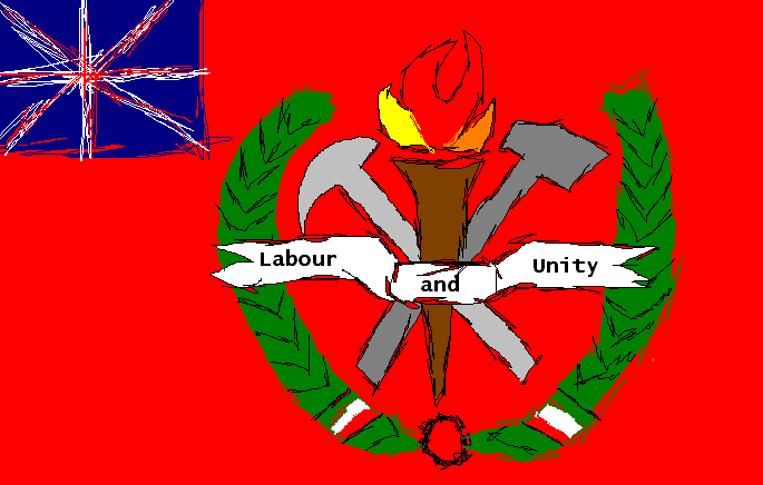
Hmmm, here is my CRUDE CONCEPT for the UoB flag...

It is a VERY CRUDE CONCEPT...and no, those are not small flags of hungary, they're Chartist flags! The terrible bundle of lines is supposed to be Union Jack. :p

uob_concept.png

Ok, here are 2 attempts, I incorporated elements from several areas. I hope you like the gold symbol . . . I put a lot of work into that :) :( :confused:

synd_uk1.jpg


synd_uk2.jpg
 
Excellent, though I'd make the emblem smaller and the Jack bigger. Also, make it so as that the cross of St. Patrick aligns with the diagonal slash on the 2nd flag (i.e. it continues across in the diagonal- atm part of it is 'stopped' by the black as it were) I was thinking maybe something like this... (don't mean to slate them, just throwing ideas in)

flag6pe.png
 
Evans said:
Excellent, though I'd make the emblem smaller and the Jack bigger. Also, make it so as that the cross of St. Patrick aligns with the diagonal slash on the 2nd flag (i.e. it continues across in the diagonal- atm part of it is 'stopped' by the black as it were) I was thinking maybe something like this... (don't mean to slate them, just throwing ideas in)

flag6pe.png


I tried to hit the cantoned jack so that its diagonal was aligned in its main axis with the diagonal of the anarchist flag, but the St Andrews and St Patrick's crosses are not symmetrical with each other in the jack. Also, the Union Jack is normally displayed in a 2:1 or 5:3 aspect ratio rather than the standard 3-2 ratio used by most flags. I found a 3:2 Jack, and used it, but getting that diagonal perfect will be tough. I was more worried about generalities at this point in any case. No offense taken :)

I can resize the crest and move it into the black easily enough, I still have everything saved with separate layers . .

When we get a consensus on what everyone wants I'll post another effort .. . :wacko:
 
Evans said:
Then I defer to your greater knowledge :)


no, you were right about the red line, I tried to center it, but yours where it is not "stopped" by the black looks cleaner . . . I just quit fooling with that part and moved on to the other side :)

The real test is whether Sarmy likes the concept at all :) or prefers the more homespun looking labor flags.

(Those look a LOT tougher to make, however :) )
 
T-hiddemen said:
Ok, here are 2 attempts, I incorporated elements from several areas. I hope you like the gold symbol . . . I put a lot of work into that :) :( :confused:

synd_uk1.jpg


synd_uk2.jpg

:) - I actually the second of these much better - although possibly make the red slightly darker. As big a fan I am of the red/black anarcho-syndicalist flag, it was historically pretty much limited to the Spanish Civil War, and wasn't used in Britain at all in this sort of period - so possibly not that appropriate! The Canadian flag has or needs to be changed already, so confusion shouldn't be that much of an issue...

Also, would it be possible to alter the symbols in the middle of the crest a bit so it contains the three symbols from the flag I posted above eg. crossed spade and wheat (or maybe replace this with a pick or hammer) with some sort of vertical torch in the middle)?
 
Sarmatia1871 said:
:) - I actually the second of these much better - although possibly make the red slightly darker. As big a fan I am of the red/black anarcho-syndicalist flag, it was historically pretty much limited to the Spanish Civil War, and wasn't used in Britain at all in this sort of period - so possibly not that appropriate! The Canadian flag has or needs to be changed already, so confusion shouldn't be that much of an issue...

Also, would it be possible to alter the symbols in the middle of the crest a bit so it contains the three symbols from the flag I posted above eg. crossed spade and wheat (or maybe replace this with a pick or hammer) with some sort of vertical torch in the middle)?


Will do!
 
Will Britain's flagging mining industry be bolstered in this alternative universe? Otherwise the representation of a miner's pick would perhaps be a little obsolete as it was an industry in definite decline...? Just doing my Devil's advocate part again :D :rolleyes: I'm imagining that the Unions would have encouraged younger workers into the mines by improving working coniditions (as the miner's pay was already quite high but conditions awful) and thus avoided the problems of an ageing workforce with little influx of new workers. All this explanation going into the imagery of a flag- but I want my nation's flag to be brilliantly thought out ;). Perversely I'm rather rational and anti-patriotic but yet am still proud of my island nation :confused:
 
In fact this rasies the more general question of Britain's economy in general... how do the staple industries fair in comparison with the historically developing industries in this time (such as in aviation, electronics and motor cars)?
 
Sarmatia1871 said:
:) - I actually the second of these much better - although possibly make the red slightly darker. As big a fan I am of the red/black anarcho-syndicalist flag, it was historically pretty much limited to the Spanish Civil War, and wasn't used in Britain at all in this sort of period - so possibly not that appropriate! The Canadian flag has or needs to be changed already, so confusion shouldn't be that much of an issue...

Also, would it be possible to alter the symbols in the middle of the crest a bit so it contains the three symbols from the flag I posted above eg. crossed spade and wheat (or maybe replace this with a pick or hammer) with some sort of vertical torch in the middle)?


Ok, I did not play with the red yet, left it the same as the red on the jack, if you want it darker, I certainly can . . I looked for graphics of wheat, and picks and shovels/spades and the first thing I found that matched with the others was the shovel you see . . . If you would rather have wheat than a hammer let me know . . . I am not to certain on the exact symbology of the Syndicals :)

syn_uj.jpg
 
Indeed.
 
Evans said:
Will Britain's flagging mining industry be bolstered in this alternative universe? Otherwise the representation of a miner's pick would perhaps be a little obsolete as it was an industry in definite decline...? Just doing my Devil's advocate part again :D :rolleyes: I'm imagining that the Unions would have encouraged younger workers into the mines by improving working coniditions (as the miner's pay was already quite high but conditions awful) and thus avoided the problems of an ageing workforce with little influx of new workers. All this explanation going into the imagery of a flag- but I want my nation's flag to be brilliantly thought out ;). Perversely I'm rather rational and anti-patriotic but yet am still proud of my island nation :confused:

:rofl: - There are many things in British history to be proud of, just not the stuff which is generally remembered or highlighted!

Well, I'd imagine that not only would miners and agricultural workers be transformed in a typical socialist manner into the heroic representative figures of the Worker's Nation of Britain, but that there would be an increased drive for self-sufficiency following the experience of an even more protracted U-Boat blockade during the war. So, increased resources and manpower are going to go into developing farming and mining - there may even be large plants transforming coal into ersatz-petroleum.

As far as other industries are concerned, I don't think a large automobile industry would be likely to develop, owing to the fact that there won't really be a market for cars (what with the People's Railways running on time!), and aviation developments may not be too extensive either, as Brits aren't going to have many places to fly to, having lost the Empire! Emphasis is probably going to go into large-scale heavy industries, like mining, steel, shipbuilding and the like...
 
T-hiddemen said:
Also,

would you prefer a smaller crest/symbol superimposed on a shield which is then on the flag, rather than having the symbol directly on the flag?

And if so, should the laurel wreaths be in the shield, or surrounding it?

Picture looks good! Don't exactly get what you mean here - can you give some examples?